
The Peace Directory
A book for Pizza 4P’s Brooklyn, New York
“Would you like to try making a book called The Peace Directory?”
Kumkum asked me one day. He thought it would suit me and that I would enjoy making it.
The book introduces the people and places behind Pizza 4P’s Brooklyn, from the farmers and producers to the makers who help shape the space. It is a way of paying attention to where things come from, and to the people whose work we might otherwise overlook.

Kumkum gathered a board of references to give me a sense of the book’s look and feel. From there, I had the freedom to spend time with each partner’s story and explore how to bring it onto the page.
He encouraged me to trust my own response first, before worrying about whether someone else would like it.

I started with photographs from the team’s visits to farms and suppliers, shared by Kazuya Kubota. These visits were part of something Pizza 4P’s had been practising in Vietnam for fifteen years: getting to know where food comes from, who produces it, and how it connects us to people and nature. The photographs gave me a starting point. Kumkum encouraged me to look further into each partner’s story and experiment with the material.


I approached the book as an archive I could experiment with. I scanned vegetables, made postcards as small tributes to growers, illustrated a map of the Finger Lakes wine region, and drew another of Meridale for a family farm’s story. Throughout the process, Kumkum worked closely with me, giving feedback and helping shape how the illustrations, photo treatments and layouts came together.
As we worked through the pages, the intention stayed the same: to give some attention back to the people behind what arrives at the table I’m glad I could contribute through the things I enjoy making.


Thank you to Kumkum for trusting me with this work and guiding me through it, and to Kazu for his feedback and support. I’m grateful to have had a part in making this book.
Main Credits
Client: Pizza 4P’s US
Creative Agency: Ki Saigon
Creative Direction: Kumkum Fernando
Book Design: Kumkum Fernando & Luongdoo
Illustrations & Image Treatment: Luongdoo
Cover Illustration: Chung Hoang
Brand Direction: Kazuya Kubota
Client: Pizza 4P’s US
Creative Agency: Ki Saigon
Creative Direction: Kumkum Fernando
Book Design: Kumkum Fernando & Luongdoo
Illustrations & Image Treatment: Luongdoo
Cover Illustration: Chung Hoang
Brand Direction: Kazuya Kubota

Salary. (Sổ Lương)
Mọi người hay gọi mình là Lương. Tiếng Anh có nghĩa là "Salary" - tiền lương. Quyển sách lưu trữ nhỏ này cũng có chút liên quan đến đồng lương mình nhận hàng tháng: mình dùng nó để rong ruổi khám phá những món ăn địa phương trong từng ngõ hẻm ở Việt Nam, nhưng chủ yếu vẫn là ở Sài Gòn, nơi mình đang sống.
Những bức ảnh chụp vội để ghi nhớ thời điểm mình từng ghé ngang, có những món thấy thích liền ăn đi ăn lại hoài, đến mức ớn không thèm ăn chừng hai ba tháng luôn, tính tình cũng lạ. Nhưng ít nhất là mình yêu những lúc tự cho bản thân đi la cà khám phá, nếu có ai hỏi, mình chia sẻ lại cho mọi người biết “món này thì phải đến đúng quán kia ăn mới ngon á!"
Từ một sở thích nhỏ, mình đã có cơ hội đảm nhận các thiết kế liên quan đến chủ đề ẩm thực địa phương. Chính những ký ức ấy đã truyền cảm hứng và giúp ích cho mình rất nhiều trong công việc. Mình trân trọng những người đồng nghiệp ở Ki Saigon đã đồng hành trong suốt dự án.
Quyển sách này để ghi nhớ và dành tặng những người bạn ở Ki Saigon, cùng các khách hàng của tụi mình tại Pepsi – anh Bernie, cô Venus, chị Chi, chị An, chị Trinh, Hà, Trang, toàn thể Pepsi Team Việt Nam và Pepsi Regional Team.
Và gửi đến hai người sếp của mình, @kumkumfernando và Indraneel Guha – những người mà mình luôn mong được làm việc cùng. Những lời góp ý thẳng thắn, cùng những hình ảnh thiết kế mà ông ấy hay gửi qua Instagram thực sự đã truyền cảm hứng cho mình để tự luyện tập. Còn với Neel – người luôn đặt sự tử tế và thấu hiểu lên hàng đầu trong cách chúng mình làm việc, điều mà mình luôn cảm nhận được một cách rất rõ ràng.
Những bức ảnh chụp vội để ghi nhớ thời điểm mình từng ghé ngang, có những món thấy thích liền ăn đi ăn lại hoài, đến mức ớn không thèm ăn chừng hai ba tháng luôn, tính tình cũng lạ. Nhưng ít nhất là mình yêu những lúc tự cho bản thân đi la cà khám phá, nếu có ai hỏi, mình chia sẻ lại cho mọi người biết “món này thì phải đến đúng quán kia ăn mới ngon á!"
Từ một sở thích nhỏ, mình đã có cơ hội đảm nhận các thiết kế liên quan đến chủ đề ẩm thực địa phương. Chính những ký ức ấy đã truyền cảm hứng và giúp ích cho mình rất nhiều trong công việc. Mình trân trọng những người đồng nghiệp ở Ki Saigon đã đồng hành trong suốt dự án.
Quyển sách này để ghi nhớ và dành tặng những người bạn ở Ki Saigon, cùng các khách hàng của tụi mình tại Pepsi – anh Bernie, cô Venus, chị Chi, chị An, chị Trinh, Hà, Trang, toàn thể Pepsi Team Việt Nam và Pepsi Regional Team.
Và gửi đến hai người sếp của mình, @kumkumfernando và Indraneel Guha – những người mà mình luôn mong được làm việc cùng. Những lời góp ý thẳng thắn, cùng những hình ảnh thiết kế mà ông ấy hay gửi qua Instagram thực sự đã truyền cảm hứng cho mình để tự luyện tập. Còn với Neel – người luôn đặt sự tử tế và thấu hiểu lên hàng đầu trong cách chúng mình làm việc, điều mà mình luôn cảm nhận được một cách rất rõ ràng.
People usually call me Luong. In English, it means "Salary". This little archive book is actually tied to my monthly salary. I use it to roam around and hunt for local food hidden in small alleys across Vietnam, but mostly here in Saigon where I live.
Just a few quick snaps to remember the spots I drop by. I have this weird habit where if I like a dish, I will eat it constantly until I get sick of it and won't touch it again for months. But at least I love letting myself wander. That way when someone asks, I can tell them exactly which place serves the best version of a dish.
What started as a small hobby gave me the chance to work on design projects about local food. These memories really inspired and helped me so much in my work. I truly appreciate my colleagues at Ki Saigon for being with me throughout the project.
This book is a keepsake dedicated to my friends at Ki Saigon and our clients at Pepsi: Bernie, Venus, Chi, An, Trinh, Ha, Trang, the entire Pepsi Vietnam team and the Pepsi Regional team.
And to my two bosses Kumkum and Neel, the people I always look forward to working with. Kumkum's honest feedback and the design references he sends me on Instagram really push me to keep practicing. And Neel always puts kindness and understanding first in how we work, which is something I always feel so clearly.
Just a few quick snaps to remember the spots I drop by. I have this weird habit where if I like a dish, I will eat it constantly until I get sick of it and won't touch it again for months. But at least I love letting myself wander. That way when someone asks, I can tell them exactly which place serves the best version of a dish.
What started as a small hobby gave me the chance to work on design projects about local food. These memories really inspired and helped me so much in my work. I truly appreciate my colleagues at Ki Saigon for being with me throughout the project.
This book is a keepsake dedicated to my friends at Ki Saigon and our clients at Pepsi: Bernie, Venus, Chi, An, Trinh, Ha, Trang, the entire Pepsi Vietnam team and the Pepsi Regional team.
And to my two bosses Kumkum and Neel, the people I always look forward to working with. Kumkum's honest feedback and the design references he sends me on Instagram really push me to keep practicing. And Neel always puts kindness and understanding first in how we work, which is something I always feel so clearly.


Thích Thú Sri Lanka
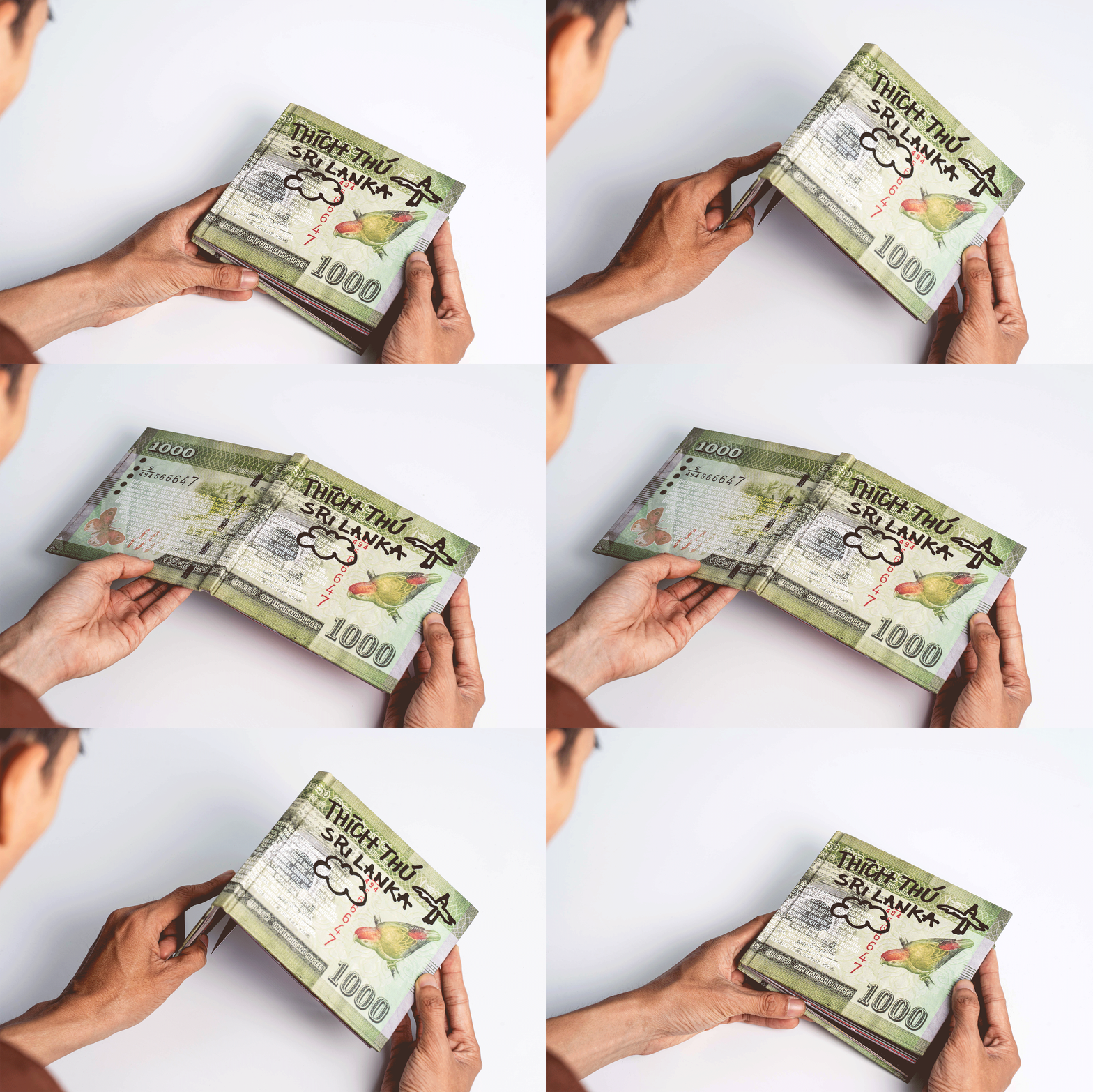
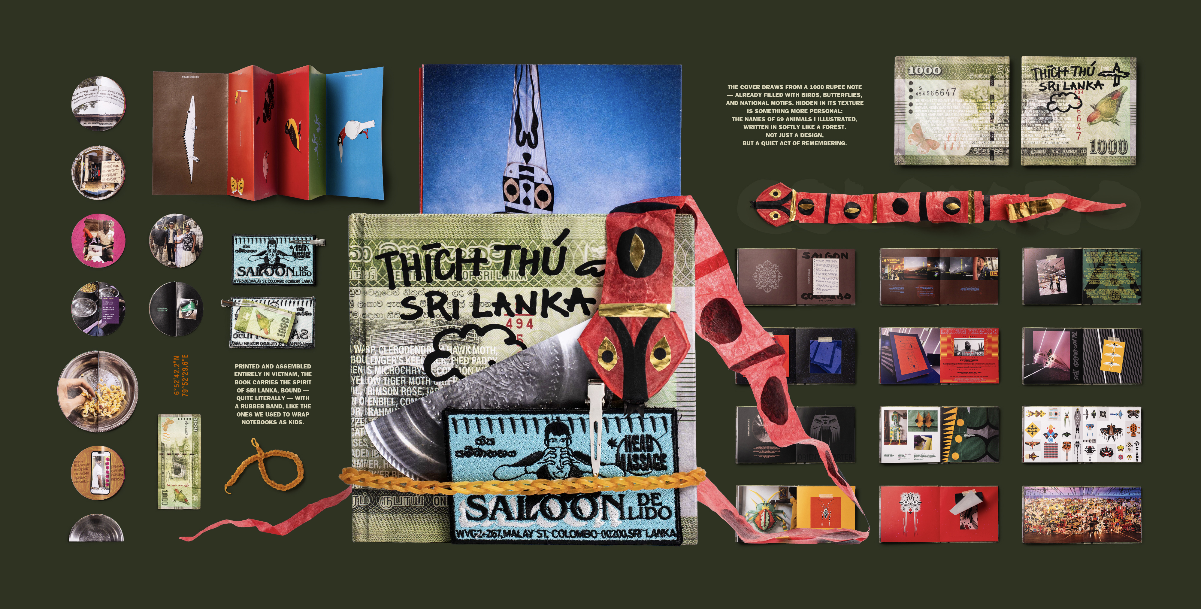
A personal artist book made between Vietnam and Sri Lanka. Quiet, hand-bound, and held together with a rubber band.
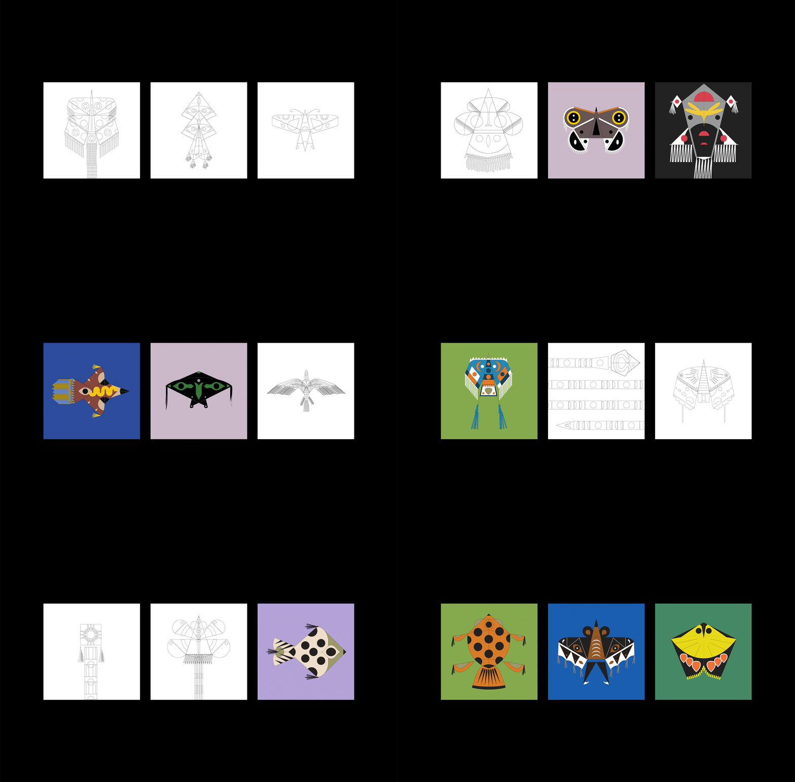
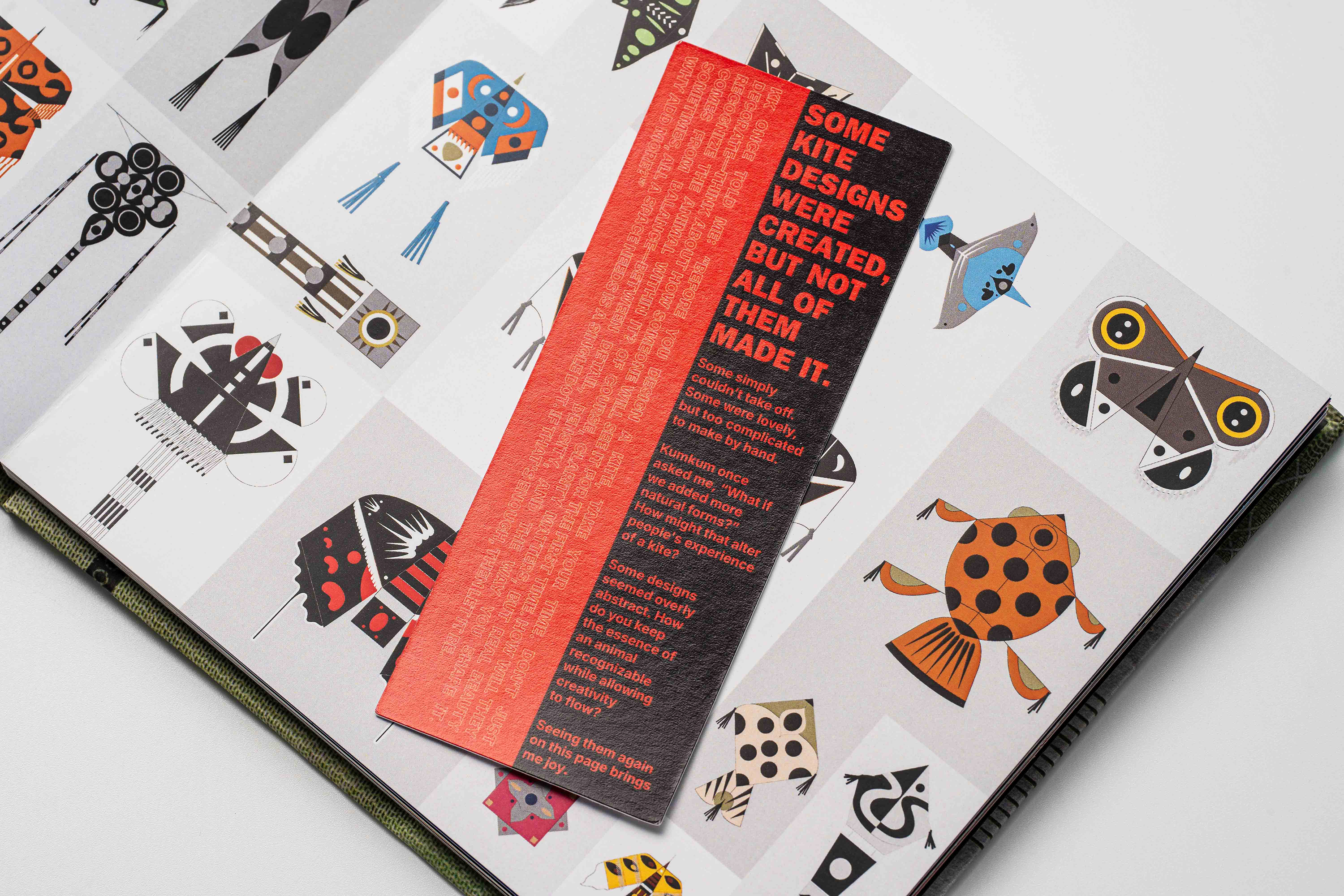
Thích Thú Sri Lanka is a personal artist book created after my first illustration exhibition in Colombo, Sri Lanka. While the original project — The Meeting in the Sky — was a large-scale kite installation featuring over 2,000 handcrafted animal-shaped kites, this book is far more intimate: an archive of impressions stitched together through paper, objects, and quiet details.
The title, Thích Thú, is a Vietnamese word that carries a quiet kind of playfulness. “Thích” means to enjoy, and “Thú” means animals — but when combined, the phrase simply means “delight.”
I chose it because it felt light, personal, and true to the heart of this project.
A name that holds both the joy of seeing animals take flight, and my own quiet affection for them.
A name that holds both the joy of seeing animals take flight, and my own quiet affection for them.


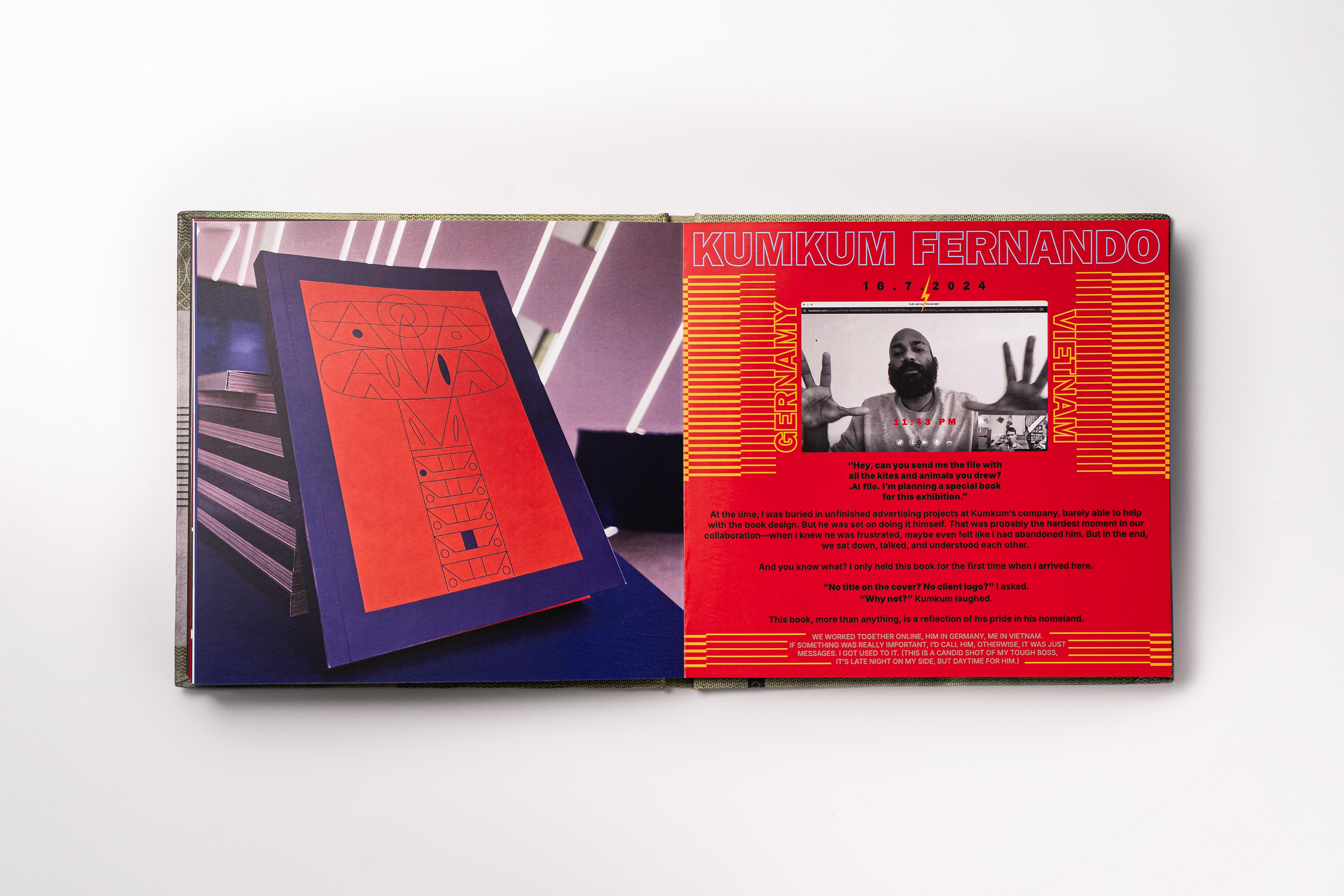
One of my favorite details is a stitched bookmark with a 1000 rupees note sewn on the back — the exact cost of a local head massage. I kept it there like a tiny voucher to use if I ever return.


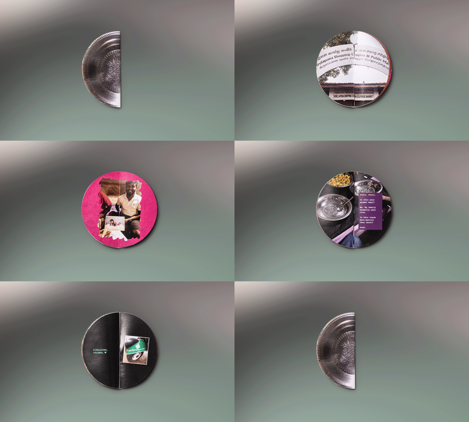
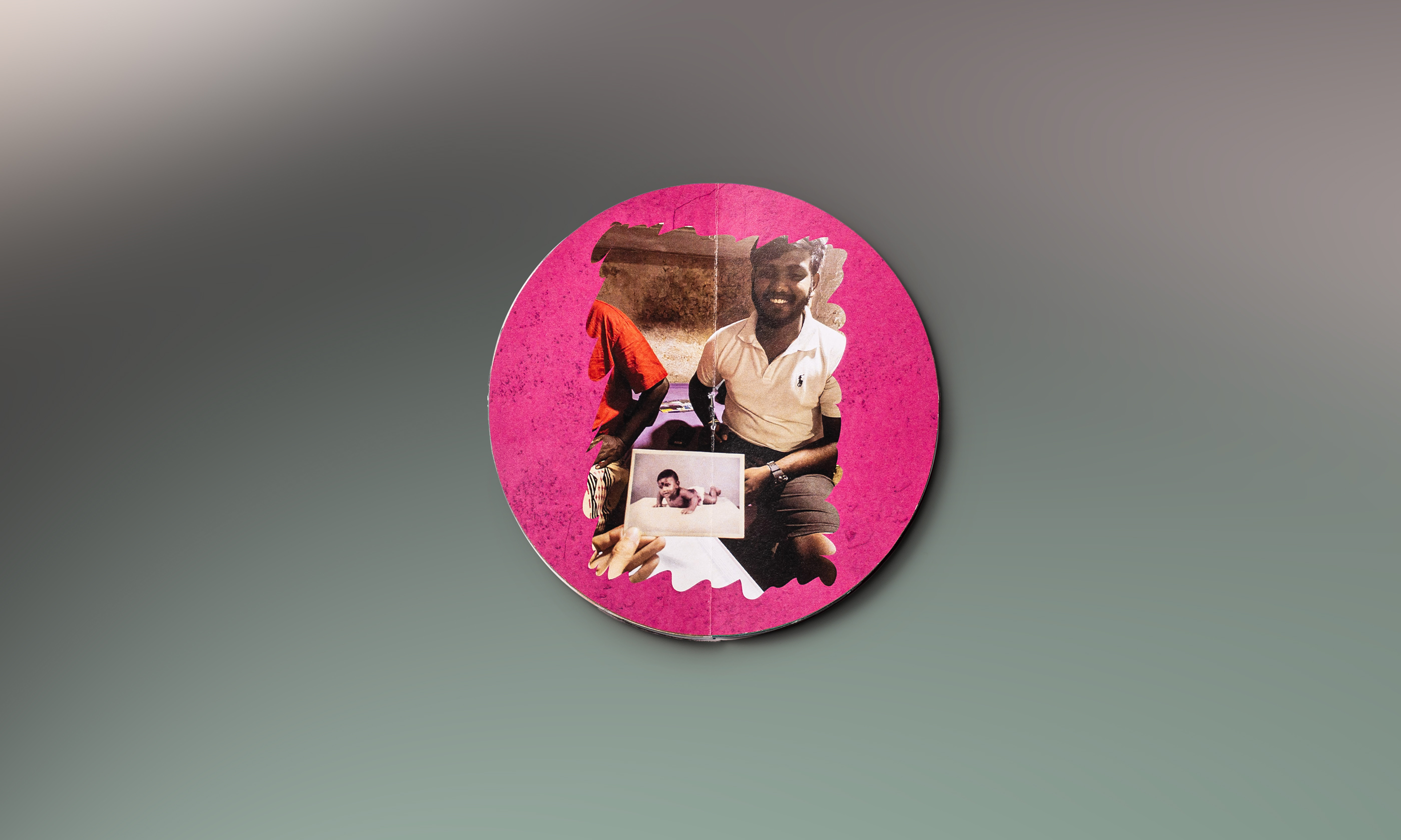
One part of the book is a round zine — shaped like the inox plate used during a dinner I had at the kite artisan’s home.
I remember chatting with a friend while brainstorming how to capture that memory, and the idea of making the zine round — like a plate you could open — just clicked. I wouldn’t have landed on that shape without that conversation.
So I made it. A small, circular piece to hold a quiet evening I didn’t want to forget.



Not everything was made by hand.
But the parts that mattered were.
Book Credits
Art Direction &Illustration – Luongdoo
Design – Luongdoo
Creative Contributor – Thanh Van
Book Photography – Thuat V
Book Production - Cropmarks
Kite Photography – Nuwan Attanayake
Developed from The Meeting in the Sky, led by Kumkum Fernando for Cinnamon Life, produced by Ki Saigon. Special thanks to Radiesha for her invitation and support throughout the journey. With appreciation to Indraneel Guha for the time and trust that made this project possible.
Art Direction &Illustration – Luongdoo
Design – Luongdoo
Creative Contributor – Thanh Van
Book Photography – Thuat V
Book Production - Cropmarks
Kite Photography – Nuwan Attanayake
Developed from The Meeting in the Sky, led by Kumkum Fernando for Cinnamon Life, produced by Ki Saigon. Special thanks to Radiesha for her invitation and support throughout the journey. With appreciation to Indraneel Guha for the time and trust that made this project possible.
AFAR Magazine
Welcoming Committee
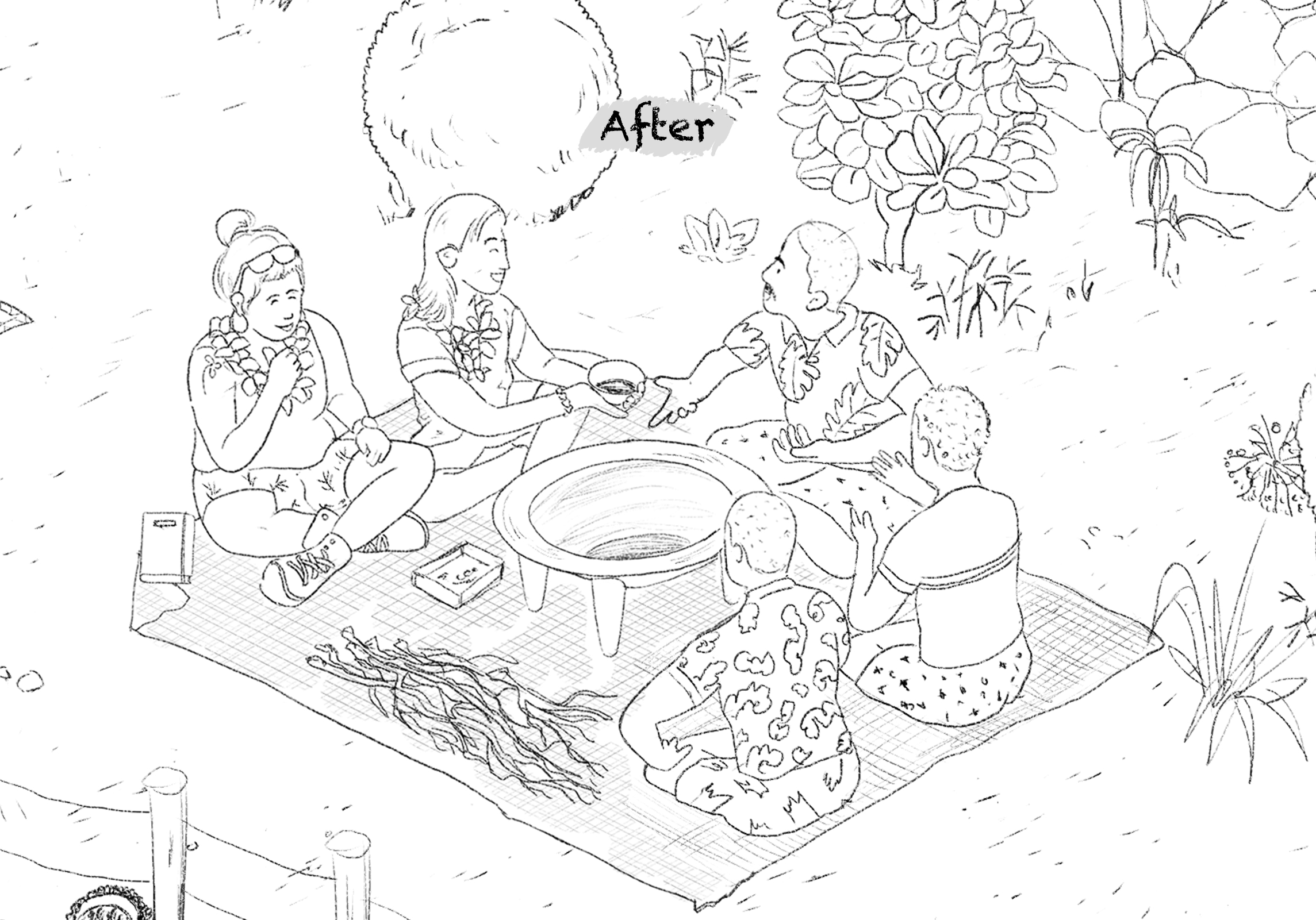
The featured full-page illustration is based on how hosts around the world warmly welcome guests using a variety of special traditions.
Client: AFAR Magazine
Creative Director: Supriya Kalidas
Art Director: Elizabeth See
Editor: Mae Hamilton
Medium: Pen and ink, Photoshop
Year: 2023
Creative Director: Supriya Kalidas
Art Director: Elizabeth See
Editor: Mae Hamilton
Medium: Pen and ink, Photoshop
Year: 2023

“At first, I viewed these countries as neighboring families”
With this in mind, I've worked to connect and rearrange the elements in an effort to create an illustration with a harmonious and cohesive whole.
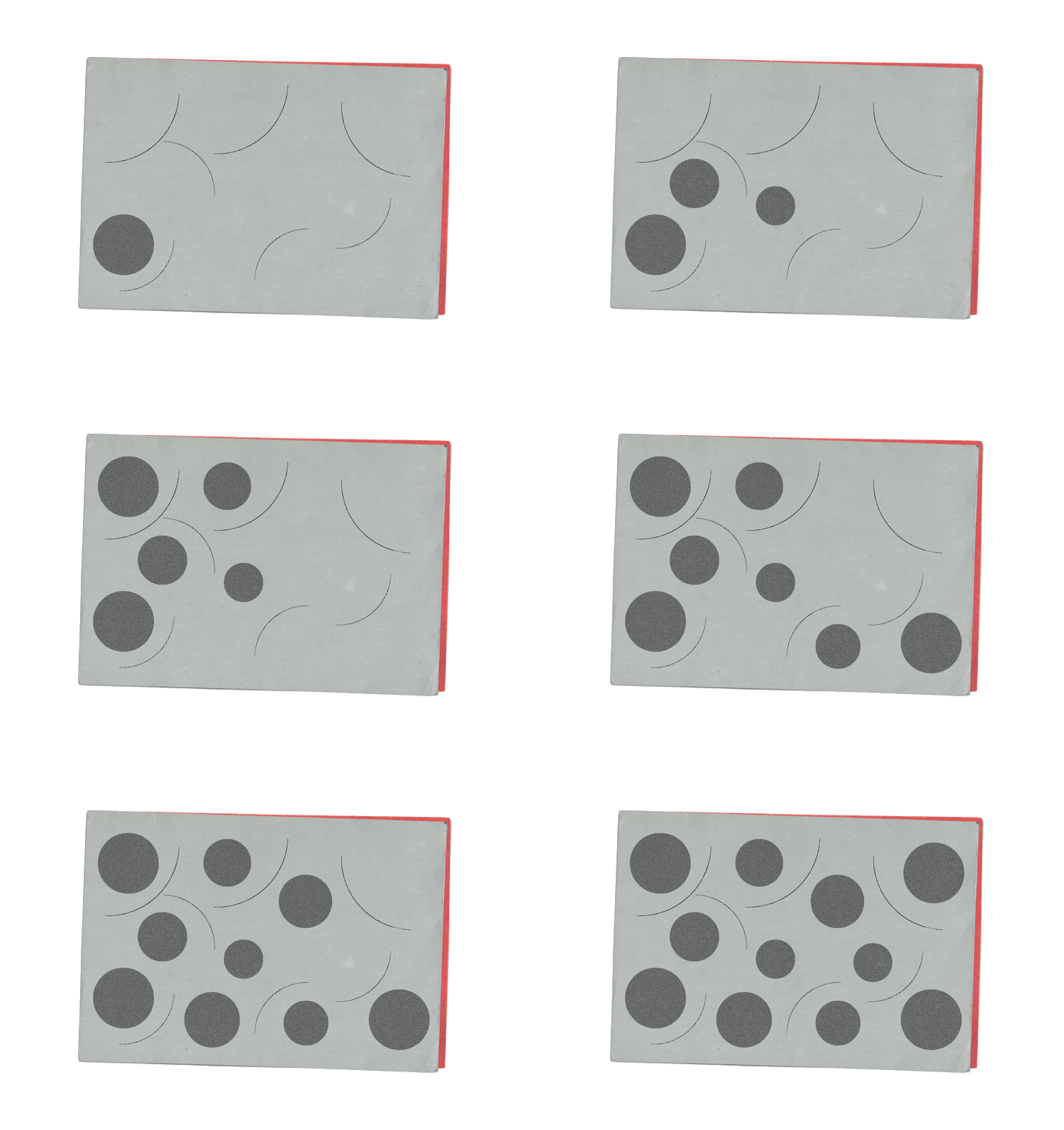
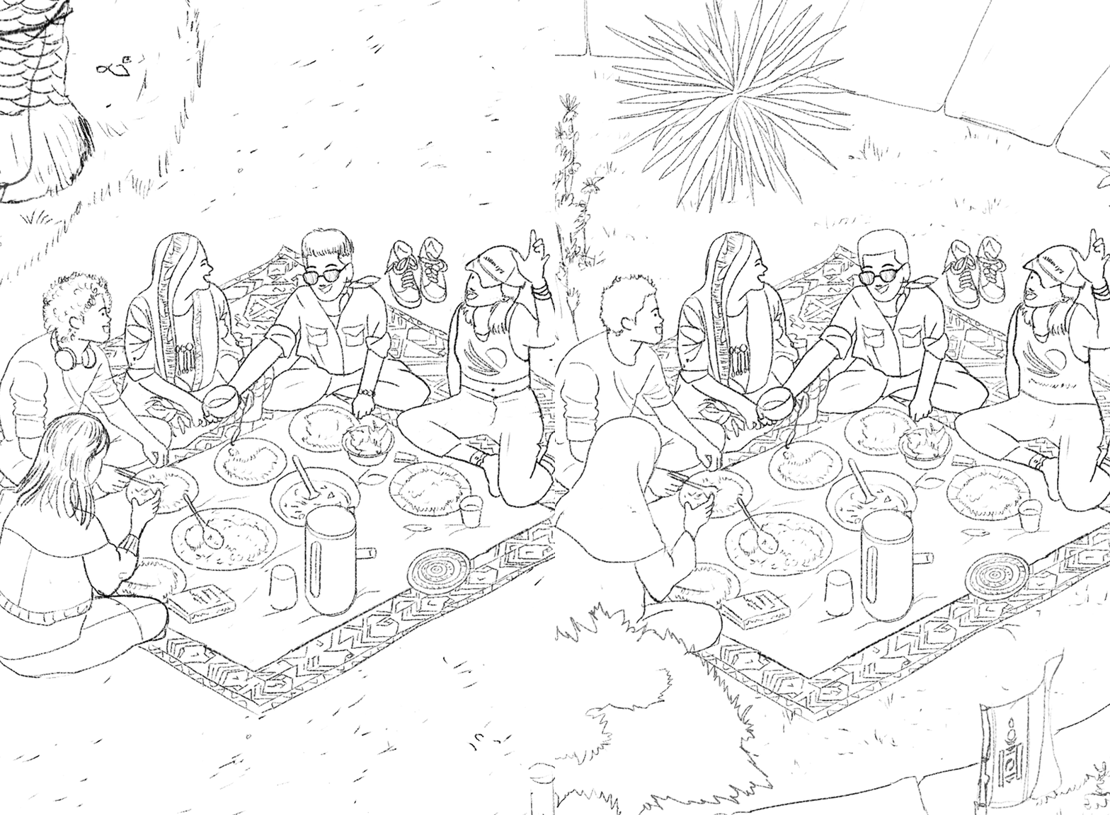
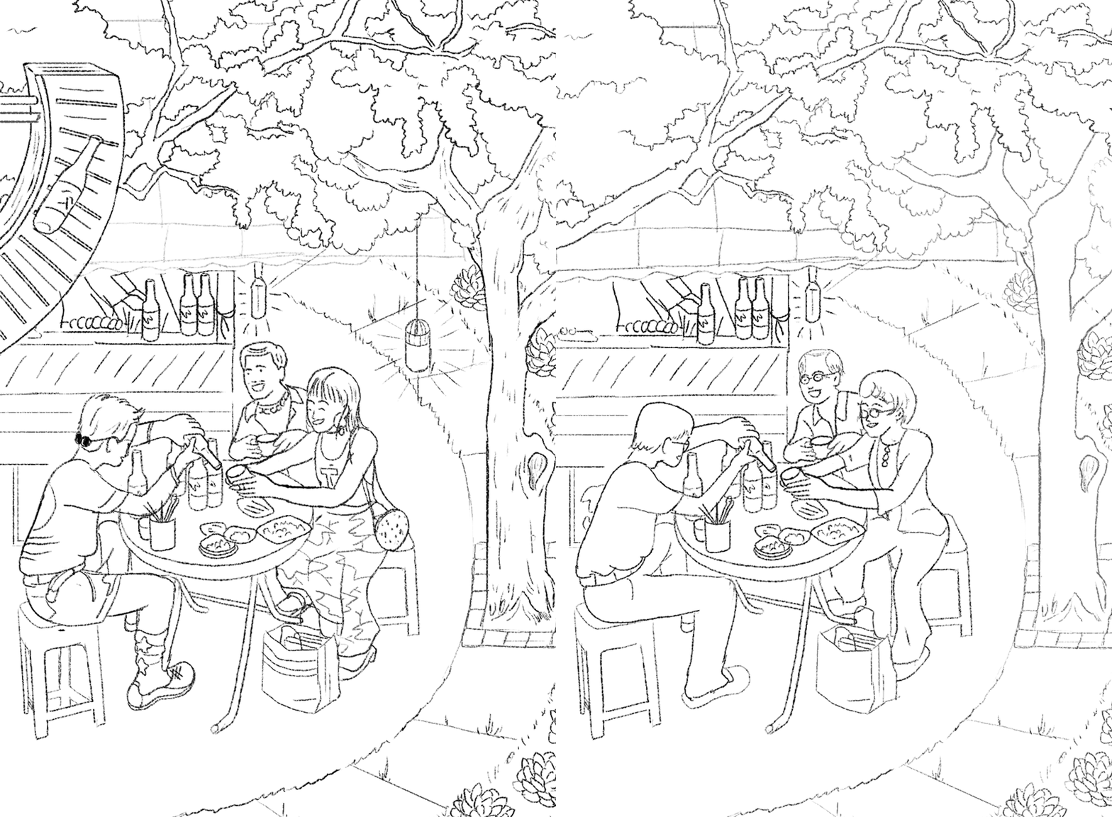
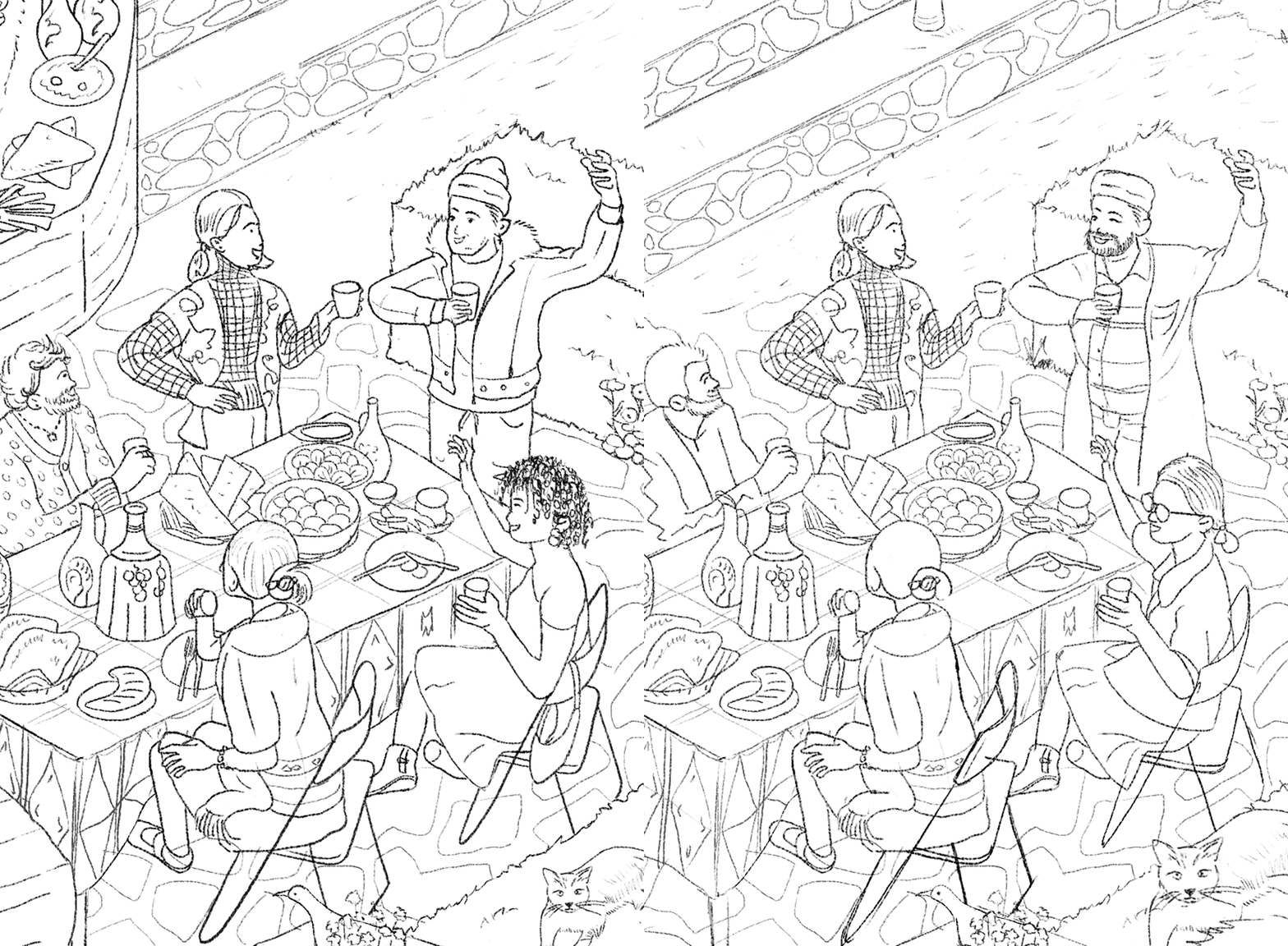
Sketch Stage
My sketch makes sure that everything is neat, helps me shape exactly what I mean to draw into the work, and makes it easier to think about making changes.



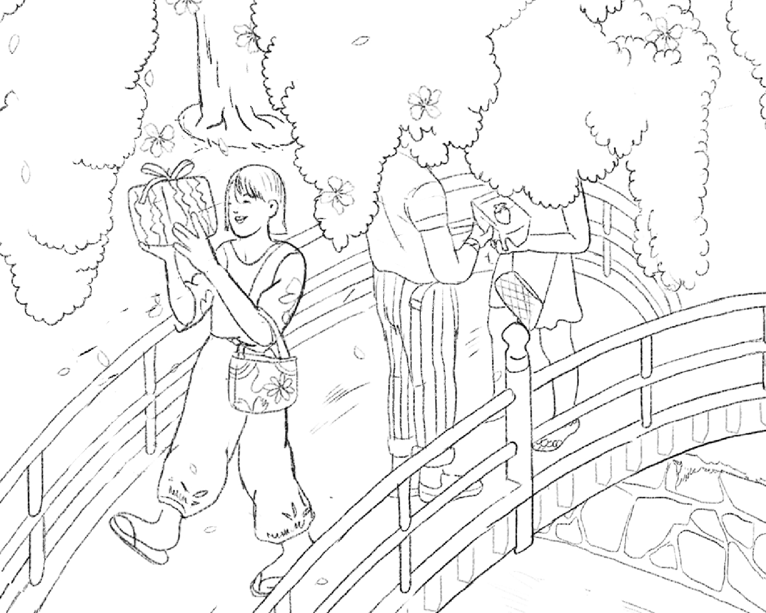
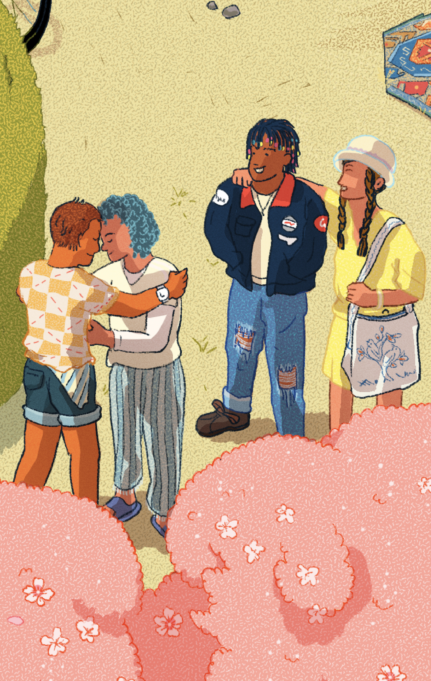
Japan
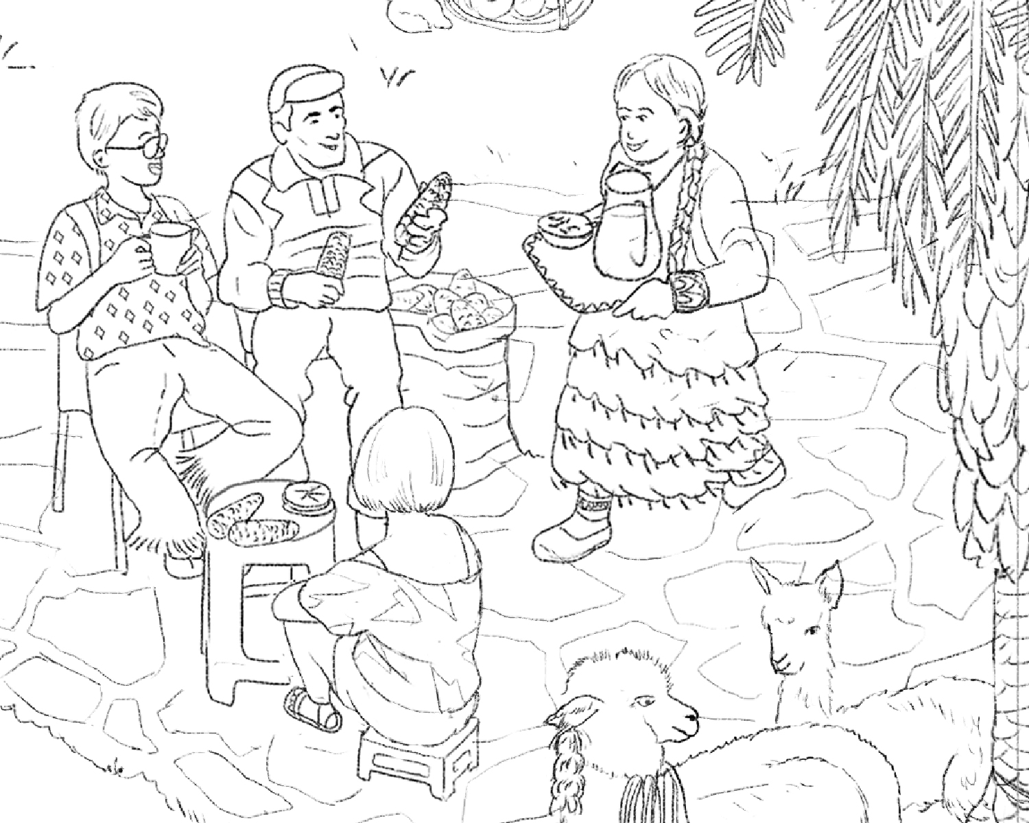
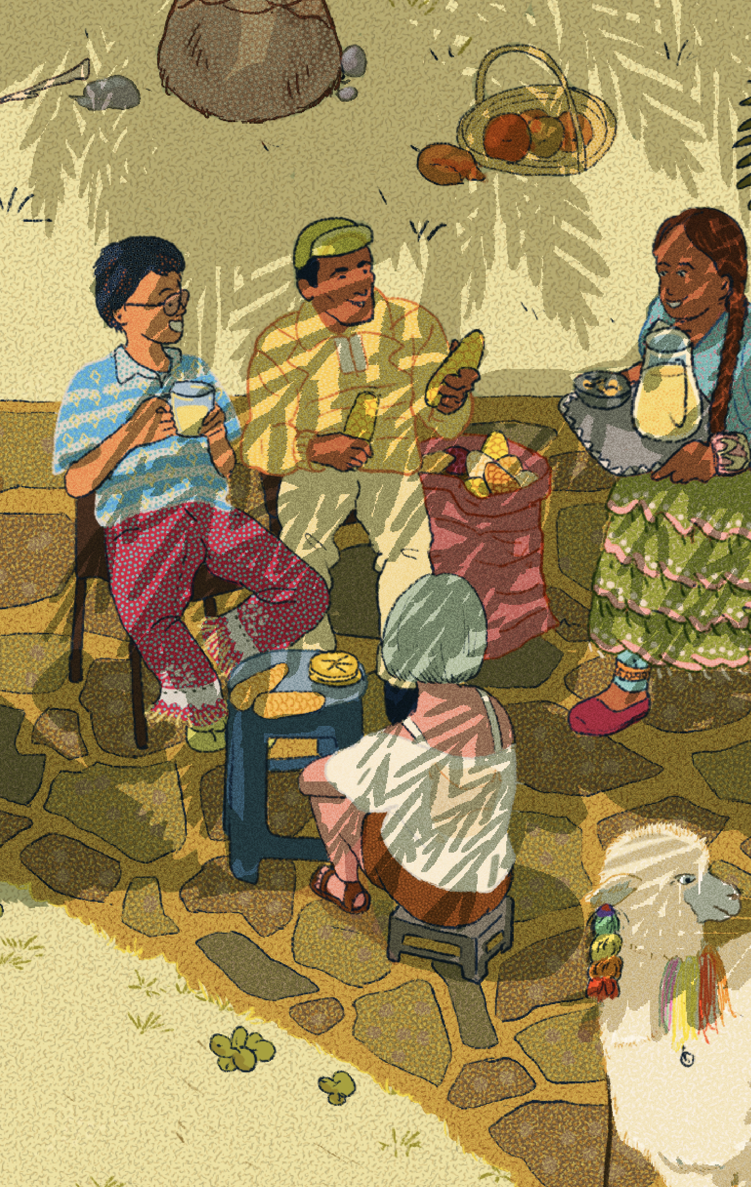
Peru
People tend to wear more modern and casual clothes instead of traditional ones, which is a clear sign of urbanism.
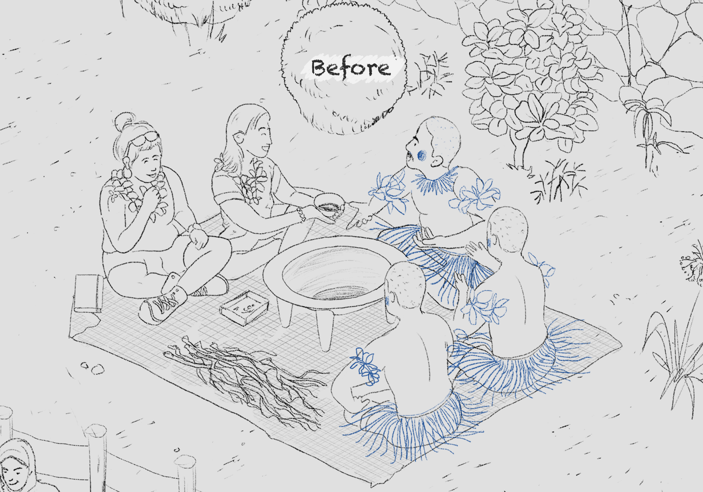
Final Art
Each regional cluster in the illustration still recognizes the uniqueness of each country's traditional hospitality.
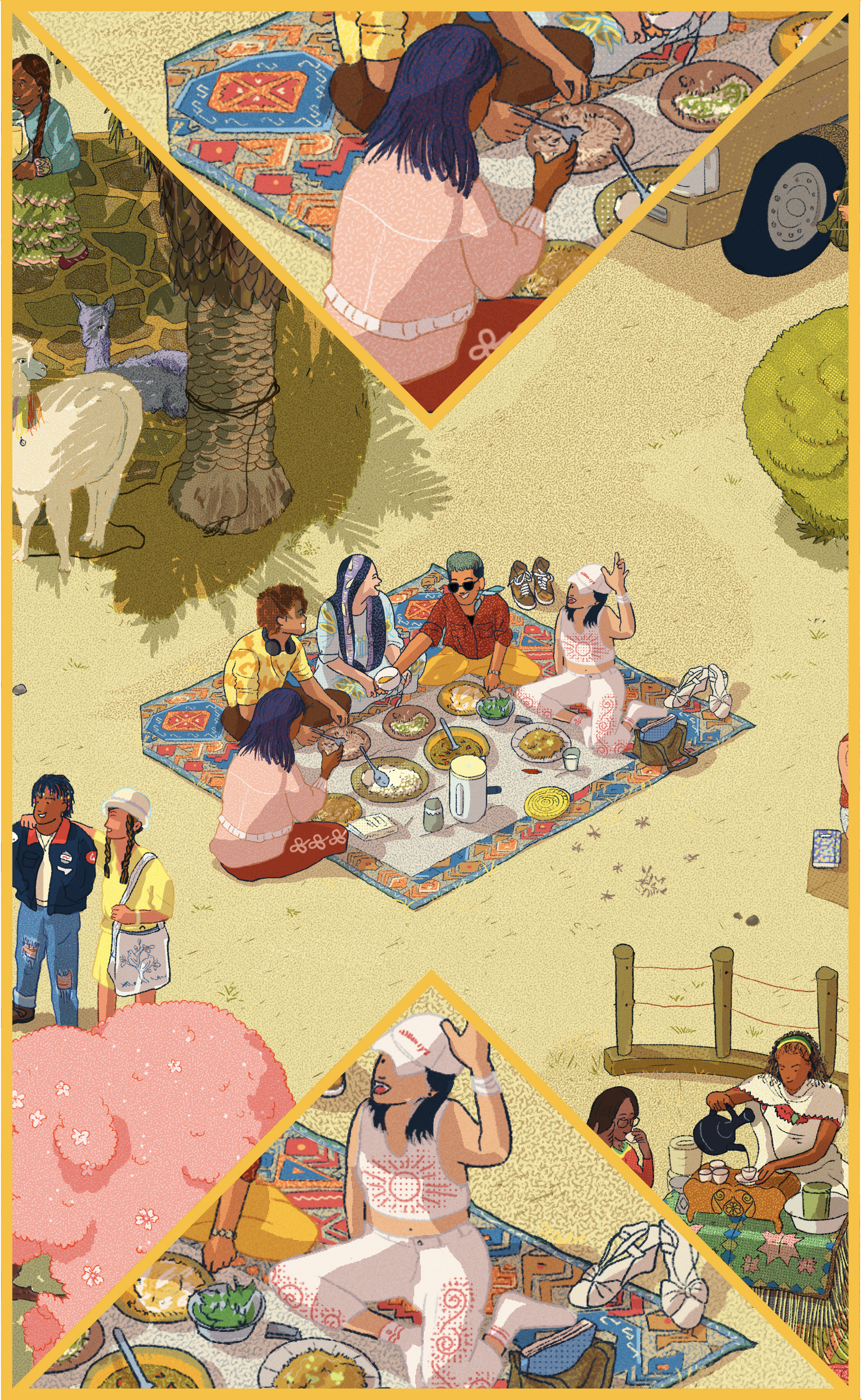
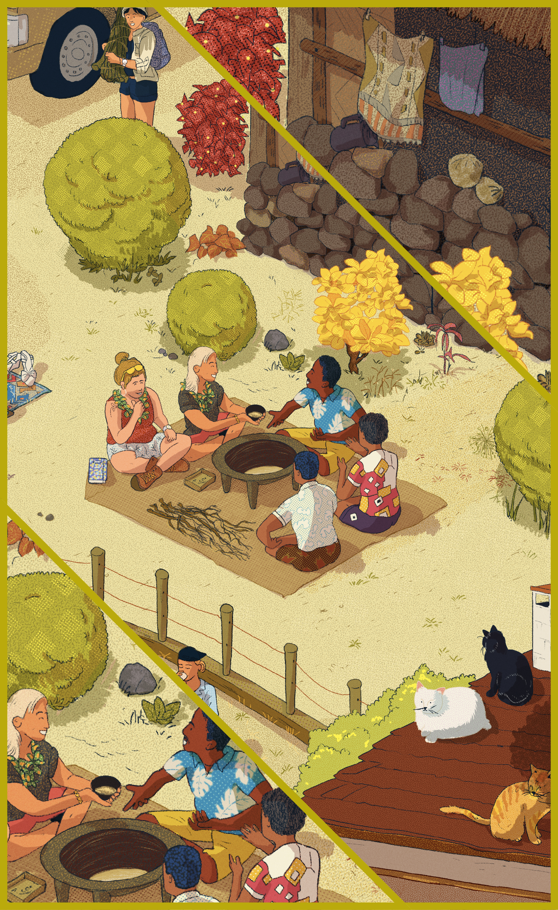

The Mori greeting of wiping one's nose and pressing one's forehead against another, Peruvian families' chicha, and the Japanese tradition of sending distinctive gifts to friends and family all convey a sense of intimacy and warmth.
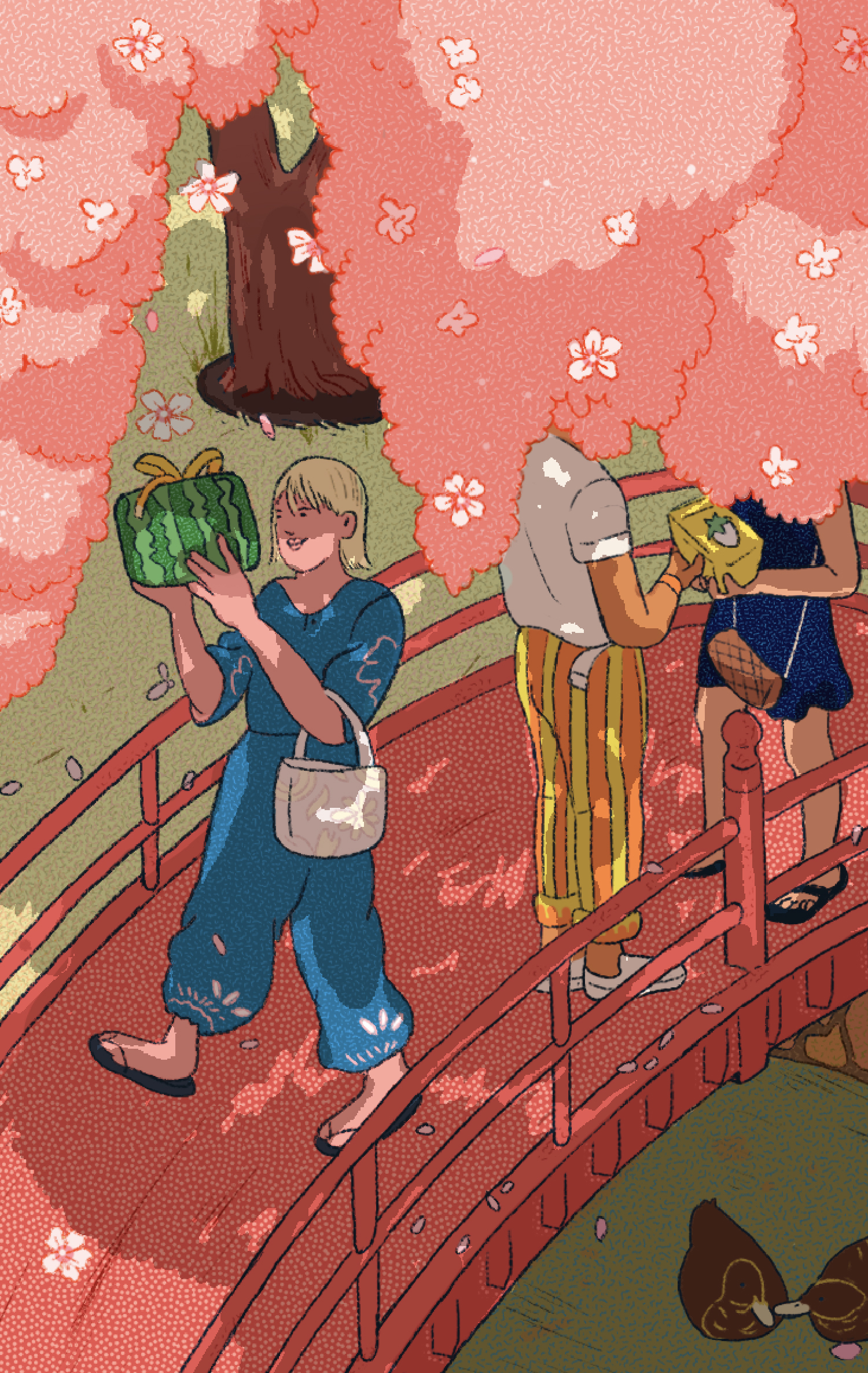

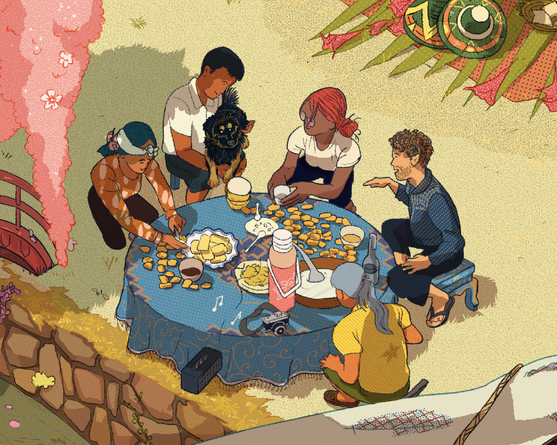
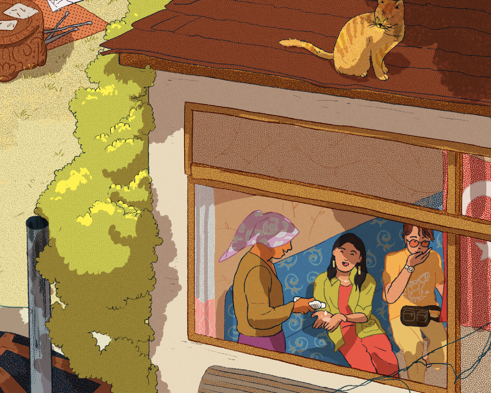
To read the article, download the AFAR Magazine app to grab a copy online
—or pick up a copy at newsstands.

Bad Options
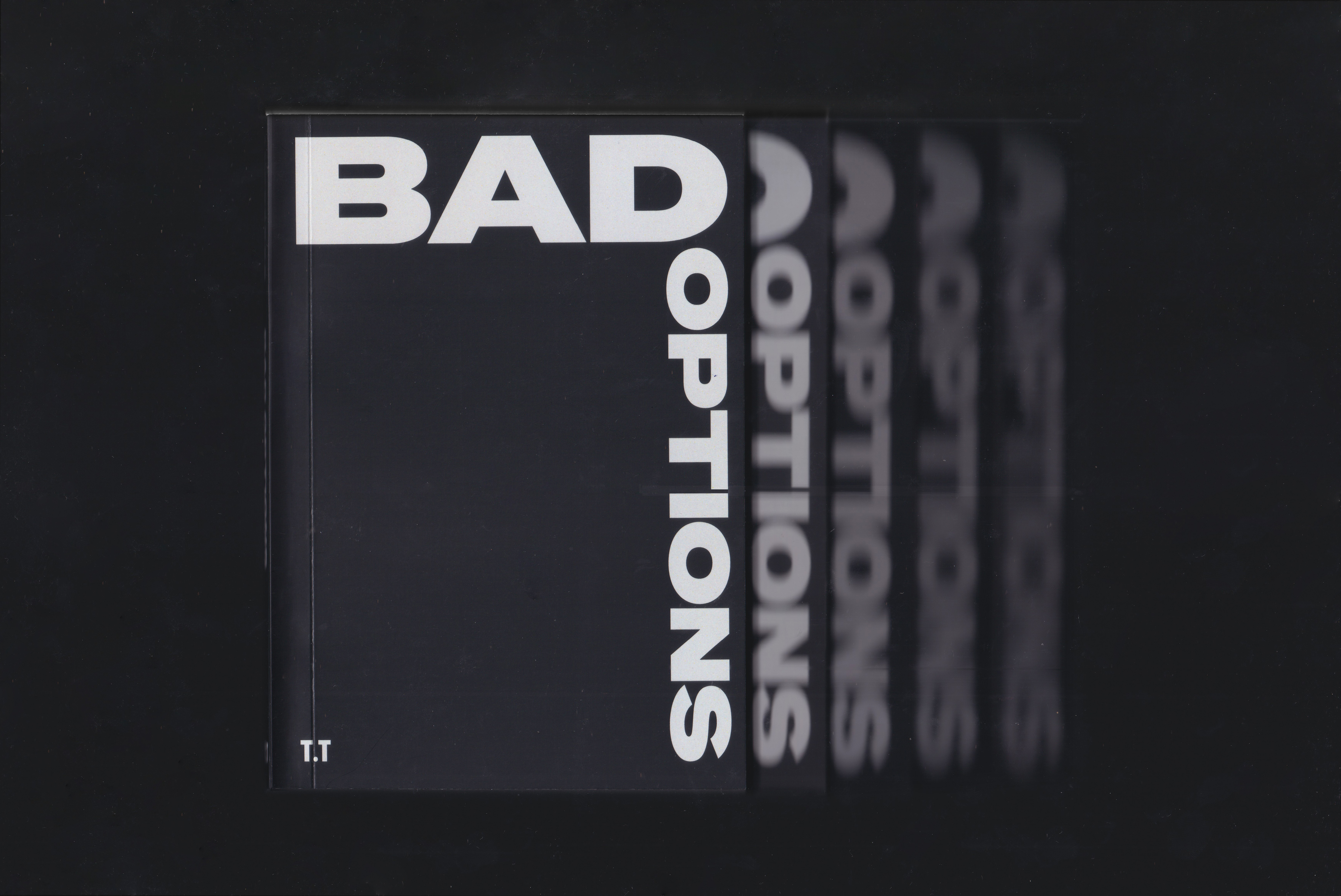
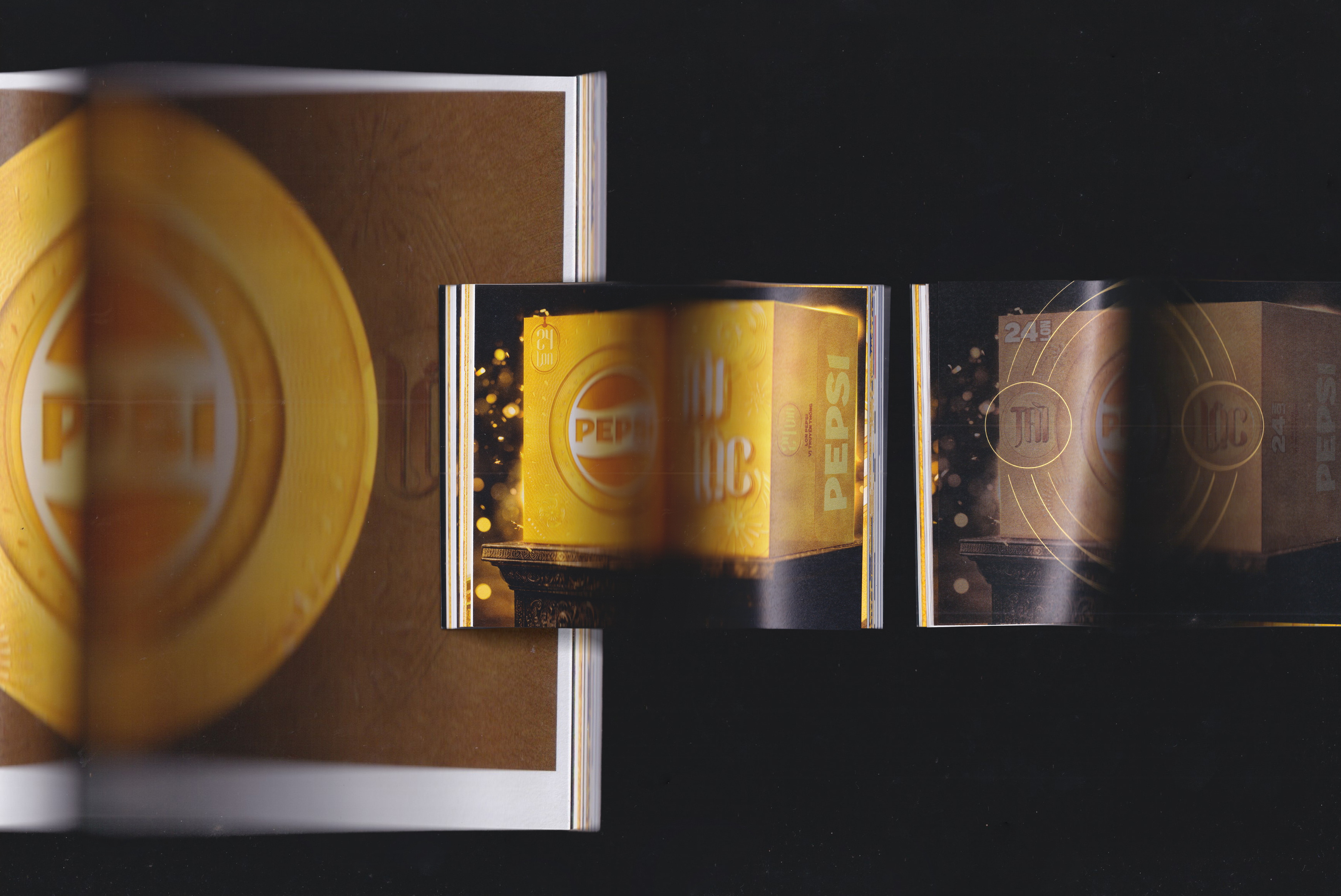
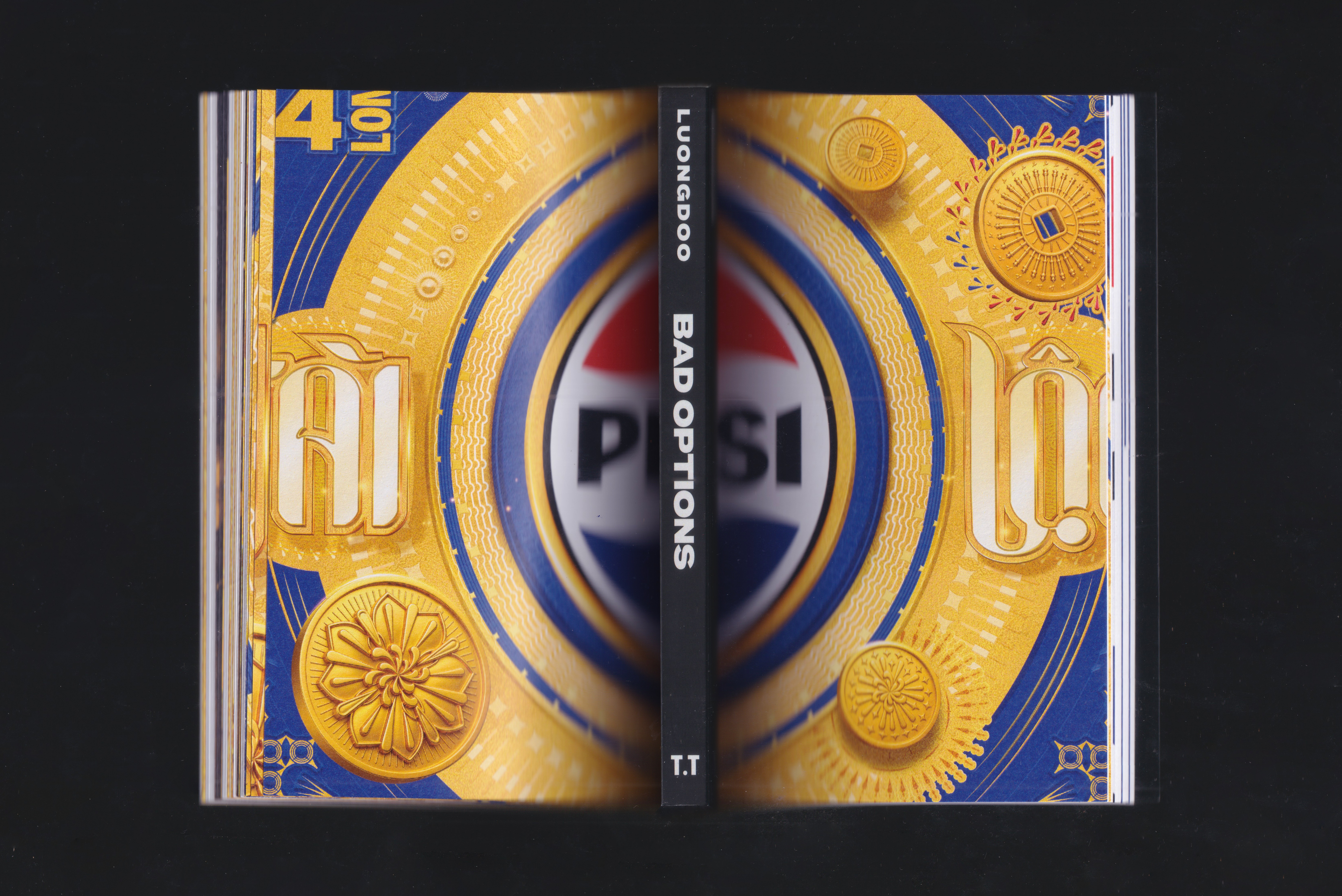
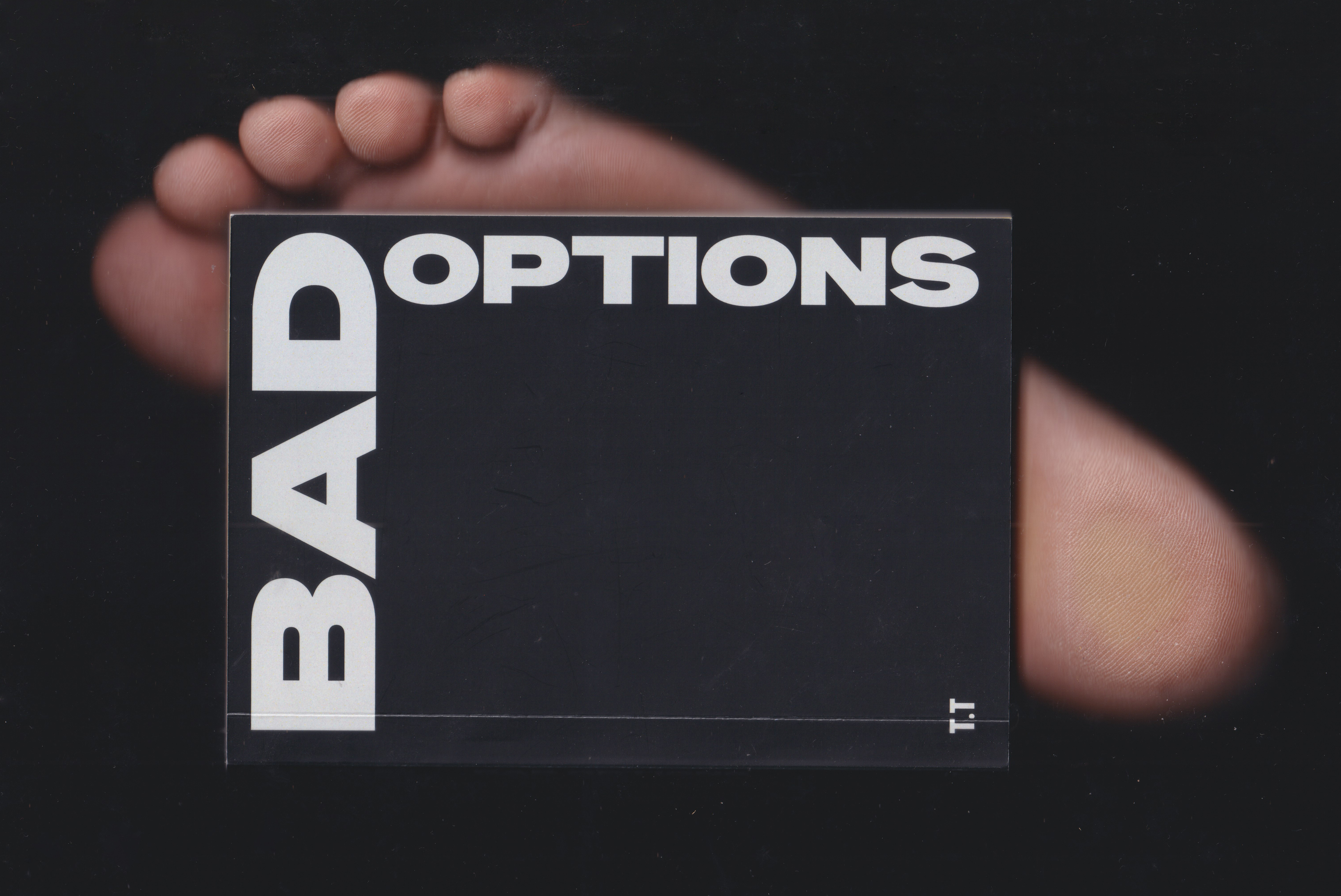
I created this book to capture the rejected options, as part of the foundation that eventually shaped the final Pepsi Tết packaging for the festive season in Northern Vietnam.
Accidentally stepping on the book after it fell to the floor brought a sharp sense of pain. At the same time, it left me unsure whether these options were ever truly bad. Right then, I think Thuy Ho, Quang Anh and Ngan probably felt it most clearly. The account team who stayed with me throughout this project.
Accidentally stepping on the book after it fell to the floor brought a sharp sense of pain. At the same time, it left me unsure whether these options were ever truly bad. Right then, I think Thuy Ho, Quang Anh and Ngan probably felt it most clearly. The account team who stayed with me throughout this project.
Final Packaging | Pepsi Northern Limited Edition 2026: Link