
High Cat
High Cat started from a simple idea around catnip.
People often say catnip makes cats a little “high”.
So we took that phrase literally.
If cats feel high, why not place them high above the city?
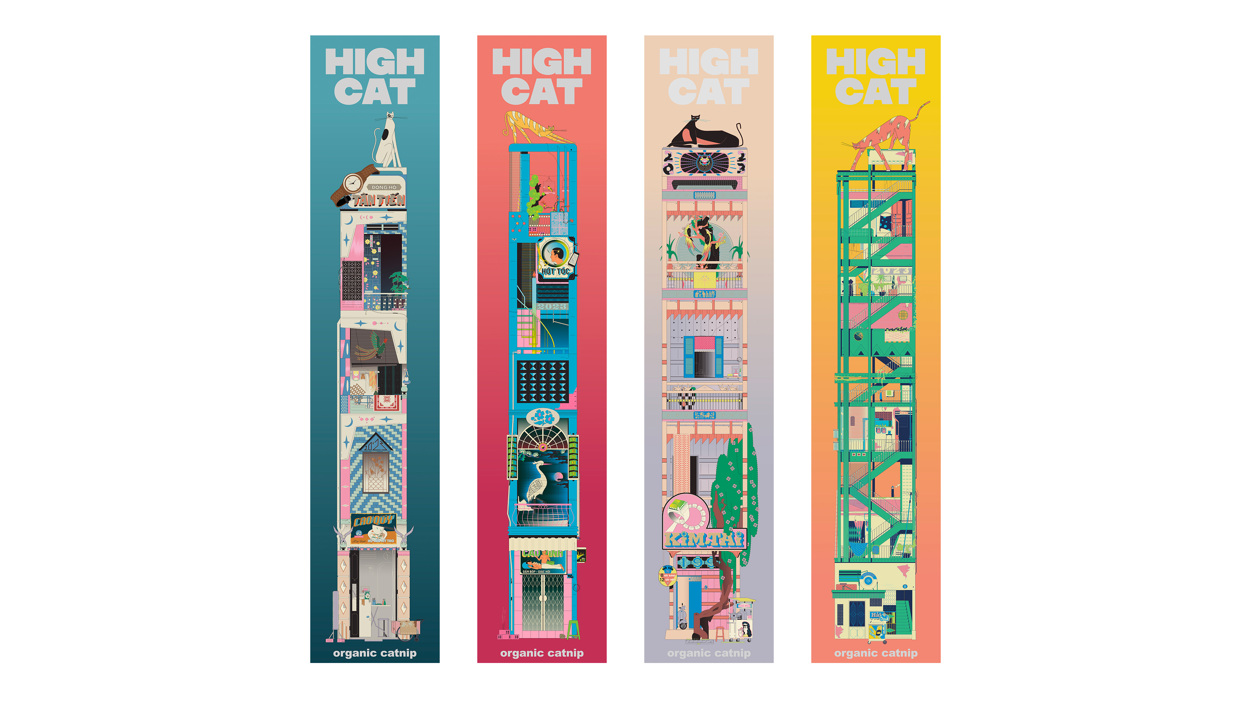
The project imagines a world where cats, slightly blissed out on catnip, drift upward and settle on the highest point of tall, narrow houses inspired by Vietnamese tube architecture. Below them, everyday street life continues as usual.
Developed as a conceptual catnip packaging series, HIGH CAT uses vertical living as both a visual language and a playful metaphor. Each illustration becomes a tall slice of the city, where cats calmly claim the top.
The full series consists of nine illustrated houses. Only four are shown here. Because like catnip itself, a little goes a long way.
The full series consists of nine illustrated houses. Only four are shown here. Because like catnip itself, a little goes a long way.
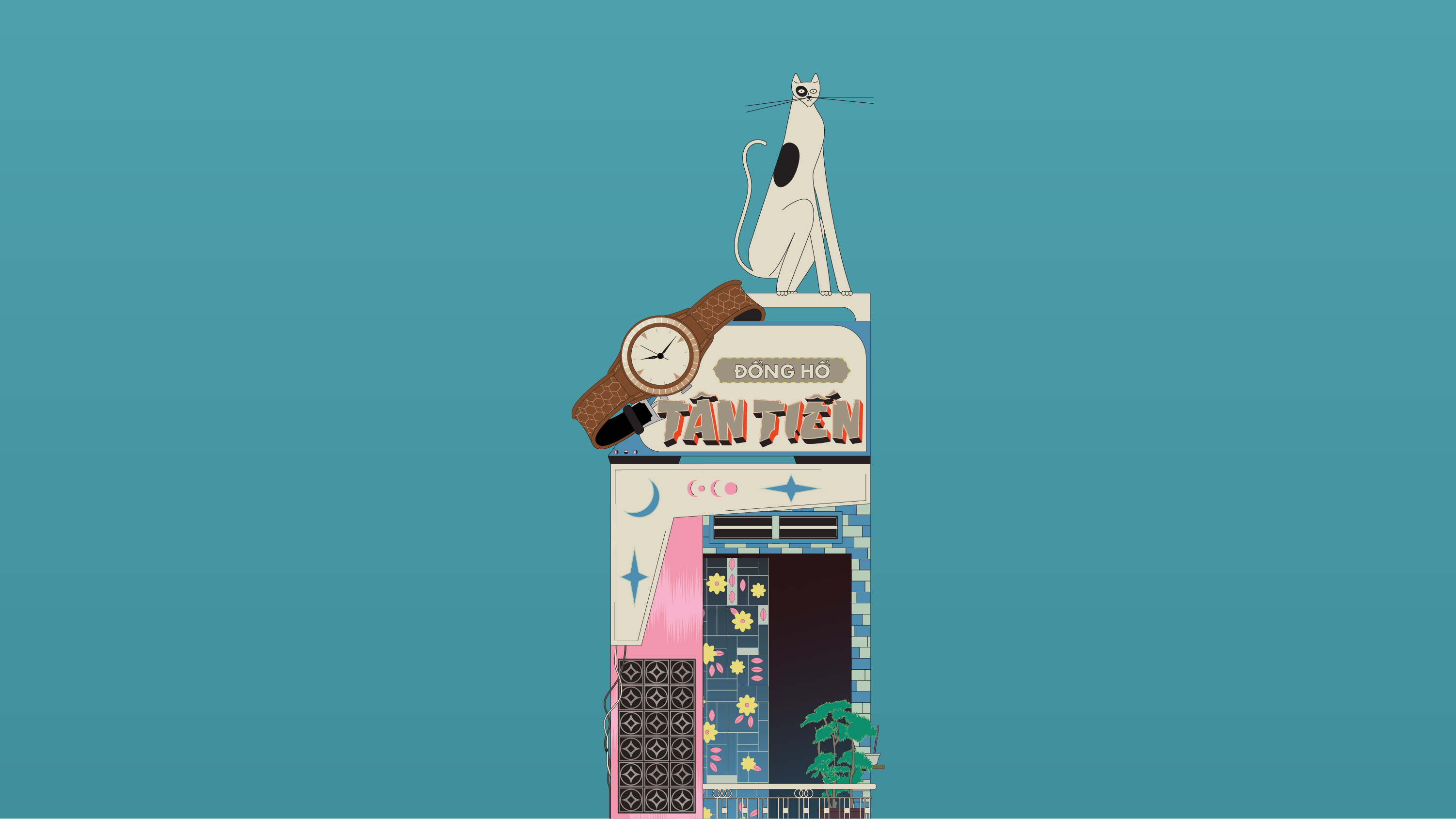
So, on one of those mornings when nothing in particular was happening…
I was sitting at a small hu tieu stall, not really thinking about anything, just watching the steam drift around.
That’s when my eyes landed on a pair sitting across from me. They show up everywhere in my life, yet I never really notice them until they suddenly do. And somehow, they are always together.
I caught myself watching them as if they were two old friends who had survived every breakfast rush in the city. Then it clicked. I was just looking at the soy sauce bottle and the chili sauce bottle, doing their usual thing.

In a part of the city I didn’t want to forget…
Somewhere on the edge of the city, there is a tiny gold shop owned by a man named Tai. If you stop there for a moment, you will probably end up with an ice-cold glass of sugarcane juice from the cart parked right outside his door.
This drawing is my way of keeping that kind of everyday memory: a tall narrow house, a stubborn old tree, a street cart, a die-cut house number that feels a bit “extra”. All the little details quietly say “Saigon” to me.
This drawing is my way of keeping that kind of everyday memory: a tall narrow house, a stubborn old tree, a street cart, a die-cut house number that feels a bit “extra”. All the little details quietly say “Saigon” to me.
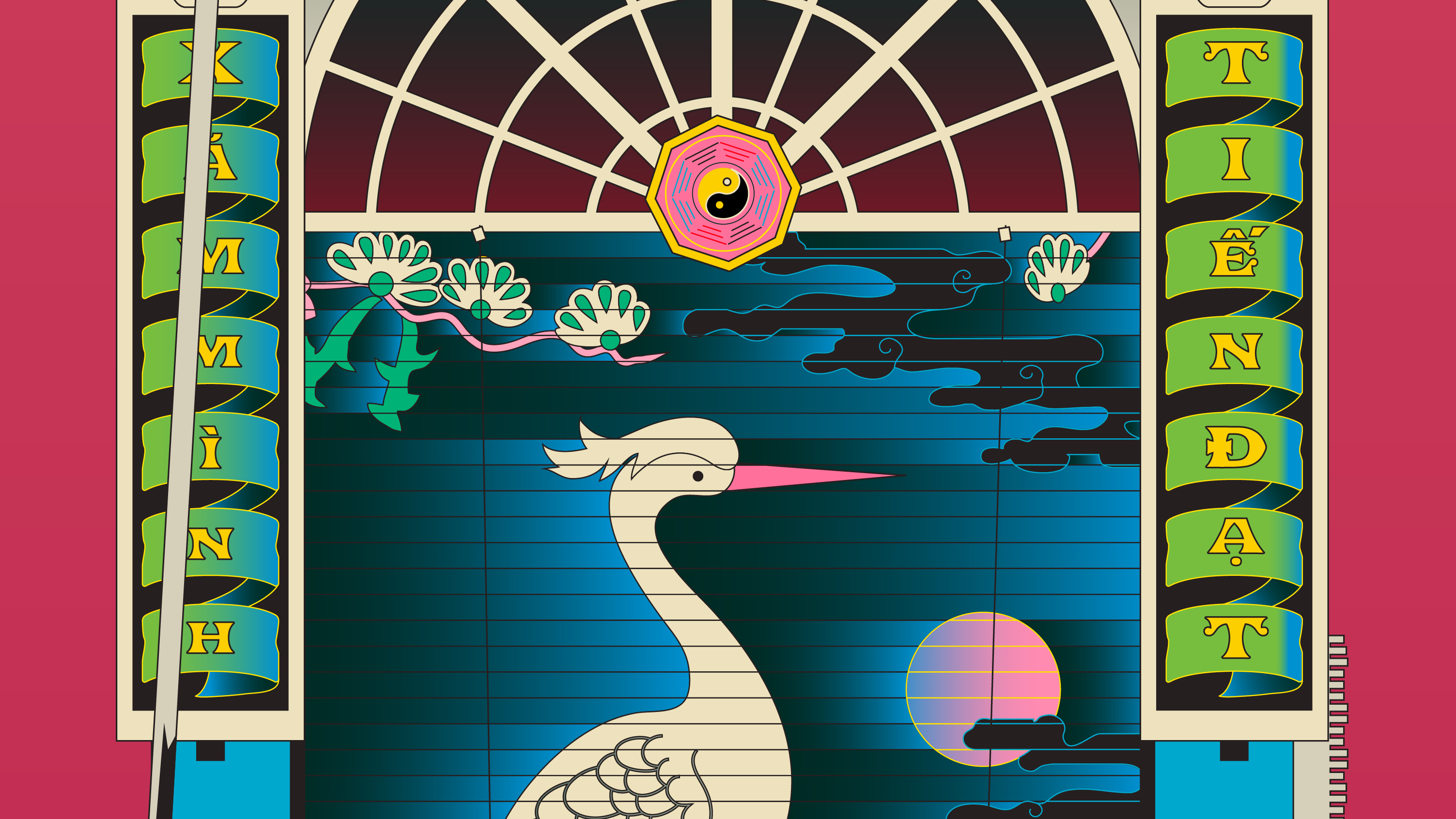
Somewhere between staircases, railings, and things half-seen…
Located on a busy street lined with office buildings whose glass windows reflect the midday sun, a slight turn of the head reveals the outline of an old, tall apartment block tucked behind them.
Power lines crisscross overhead. Below, bedsheets are hung out to dry before the light fades. Smoke drifts from a makeshift vent, following a pipe into a narrow wall gap, just enough to guess that someone is cooking something nearby.
It’s too far away to see clearly, but close enough to catch the scent. And perhaps to slow down for a moment, when the cat suddenly notices something happening inside that building across the way.
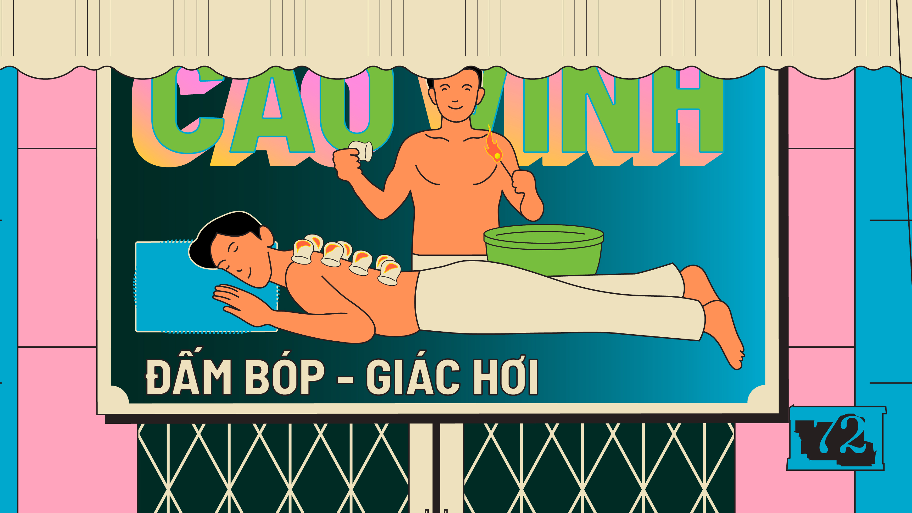
Somewhere off the main road, where you wouldn’t normally slow down…
Tucked deep inside an alley in Binh Tan District, where long-haul trucks rumble past on a dusty national road, stands a narrow three-story house.
Each floor offers a service that makes it hard to walk away without stopping for a moment of rest.
Massage, fire cupping, tattooing, haircut. I think of it as a romantic house, one that only the adventurous would dare to step into and experience. The cat resting above feels like a quiet, unpaid guardian, patiently waiting for the next visitor to arrive.
Credits
HIGH CAT (catnip packaging illustration series)
Creative Direction: Kumkum Fernando
Head of Planning: Indraneel Guha
Packaging Design & Cat Character Design: Chung Hoang & Kumkum Fernando
Lead Illustrator: Luongdoo
Additional Illustrator: Huy, Uri, Le, Mia
Done at Ki Saigon, 2023

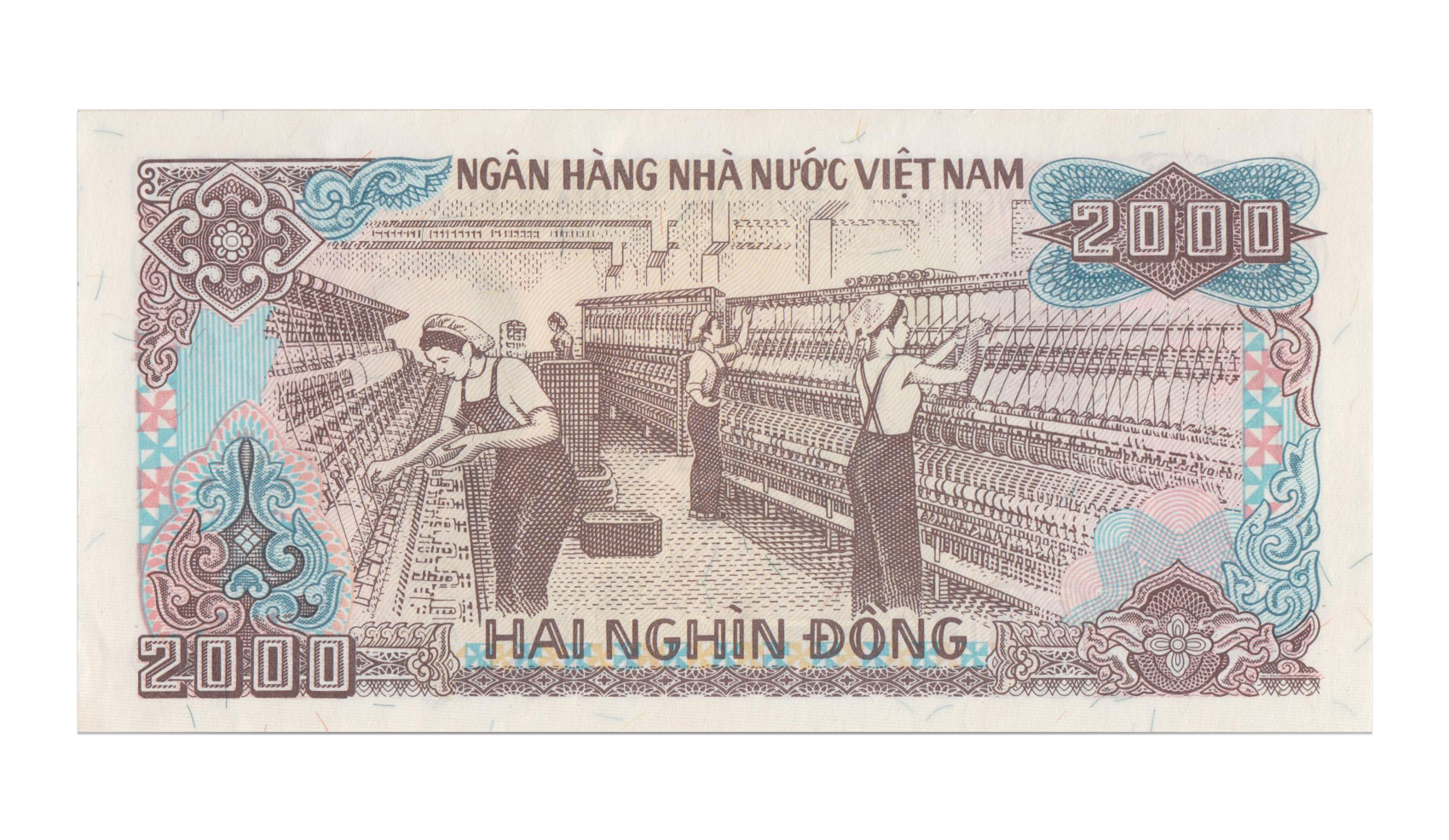
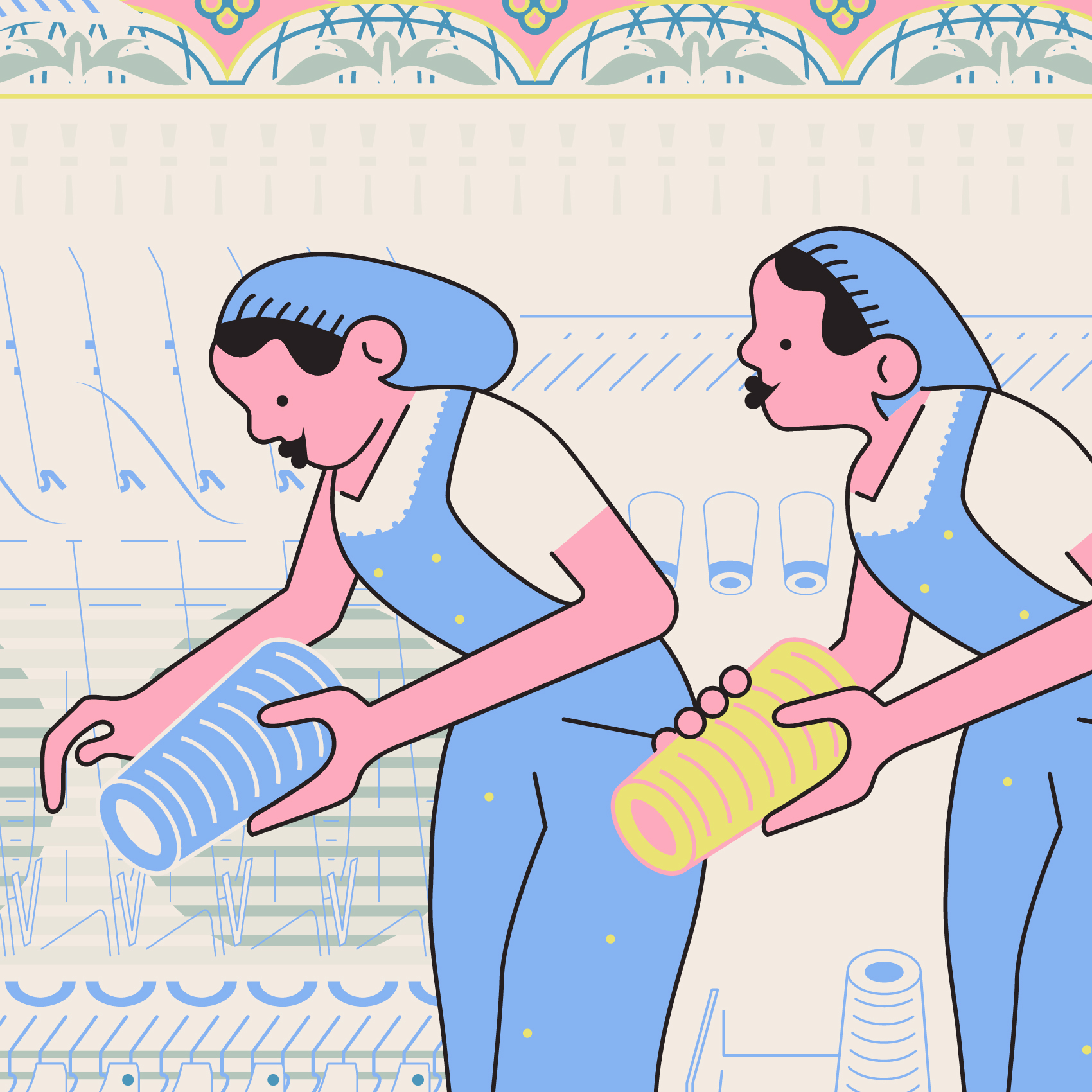
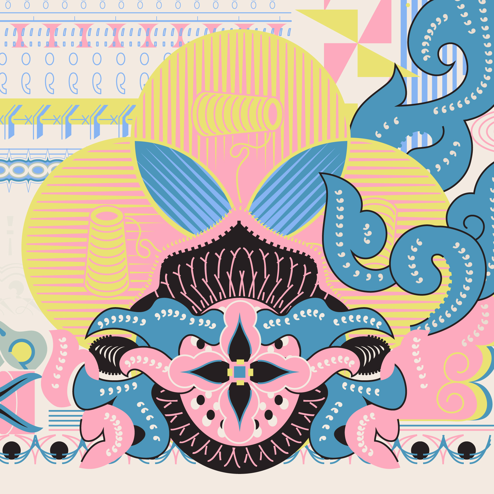
Two Thousand Threads
Honoring Nam Dinh’s Textile Workers
A heartfelt tribute to the textile workers of Nam Dinh, whose dedication and hard work are immortalized on the 2000 VND banknote. This illustration honors their enduring contributions to Vietnam's heritage.
Medium: Adobe Illustrator
Personal work
Year: 2024
Personal work
Year: 2024


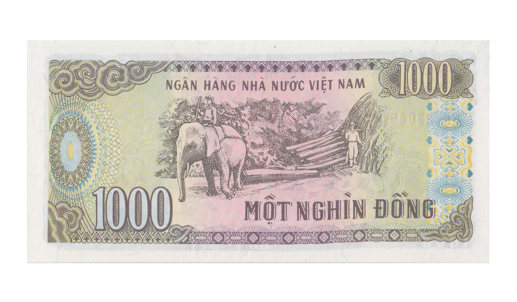
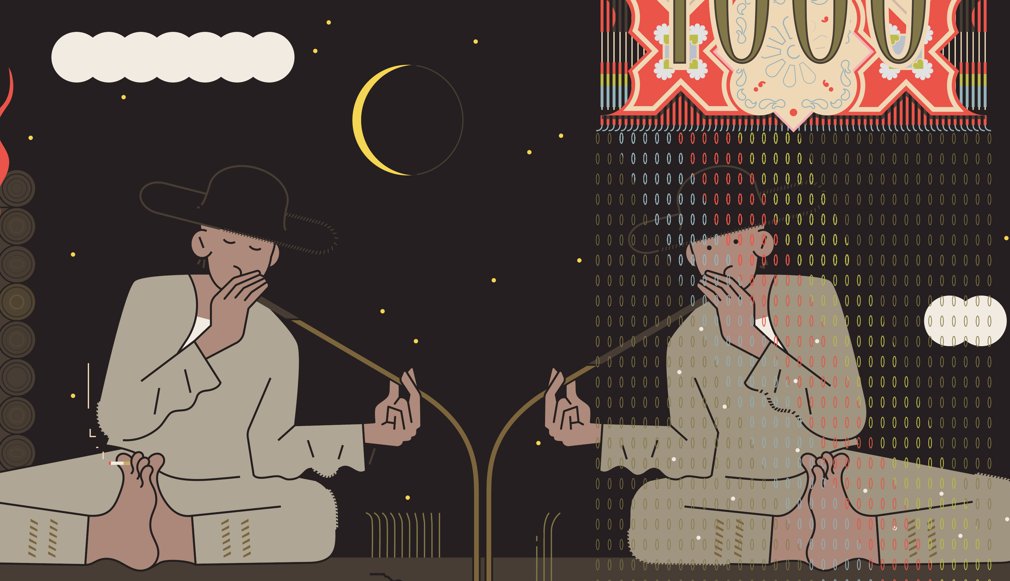
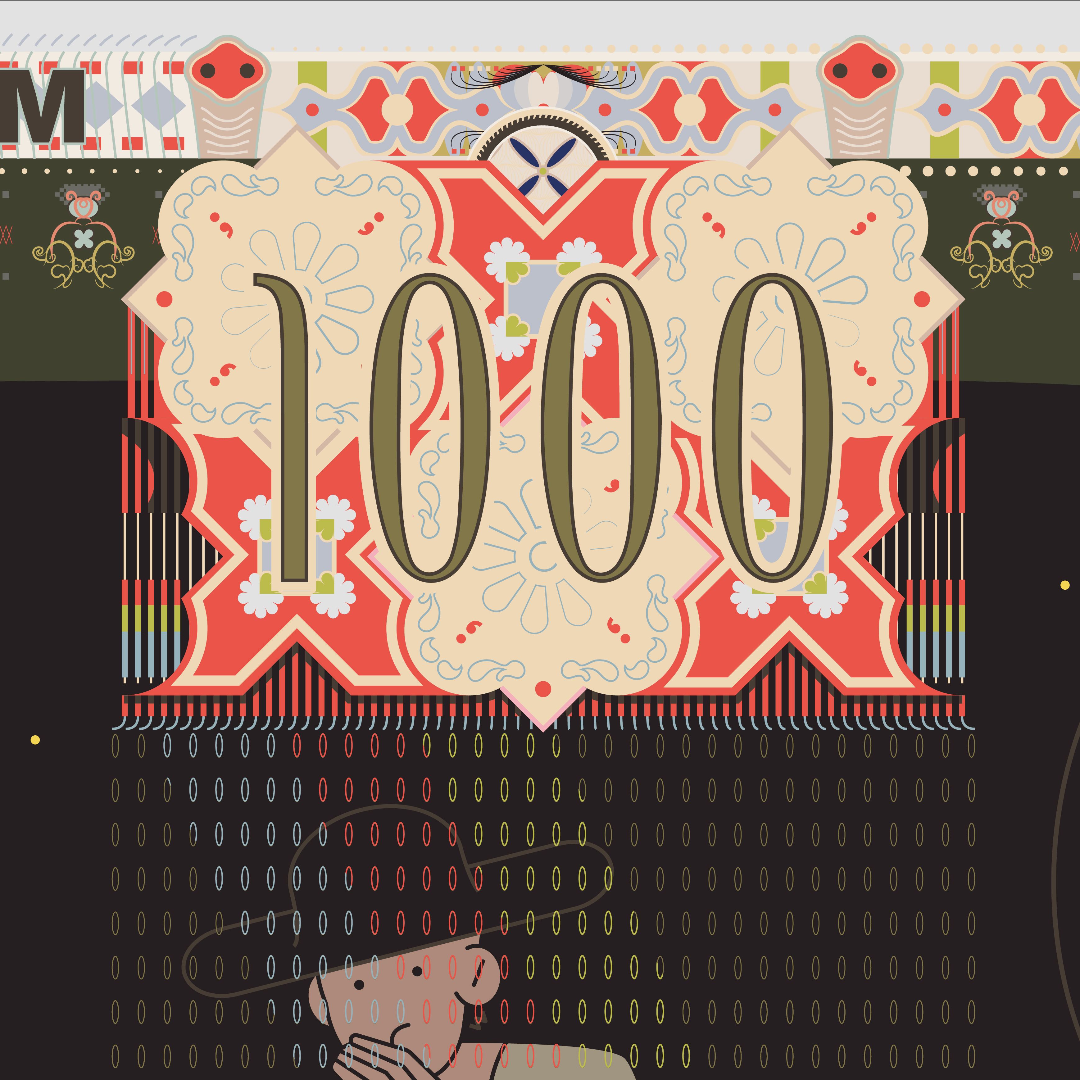
One Thousand Breaths
A Shared Tranquility
Inspired by the image on the 1000 VND note, this illustration reimagines the relationship between highland workers and elephants. Rather than focusing on labor, it portrays a moment of harmony, where both humans and elephants pause to enjoy nature together. This peaceful scene reflects my vision of a bond built on respect, where both can find a moment to relax and rejuvenate in the shared beauty of their surroundings.
Medium: Adobe Illustrator
Personal work
Year: 2024
mPersonal work
Year: 2024

Richly evocative elements like CAN wine ( 'Rượu Cần' ), the warmth of the fire, and the vibrant brocade motifs have long been celebrated, weaving a tapestry of memories that stretch back through time.

“MỘT NGHÌN Đ” is there in the jars, softly placed. Not to draw attention, just to sit quietly with the scene.

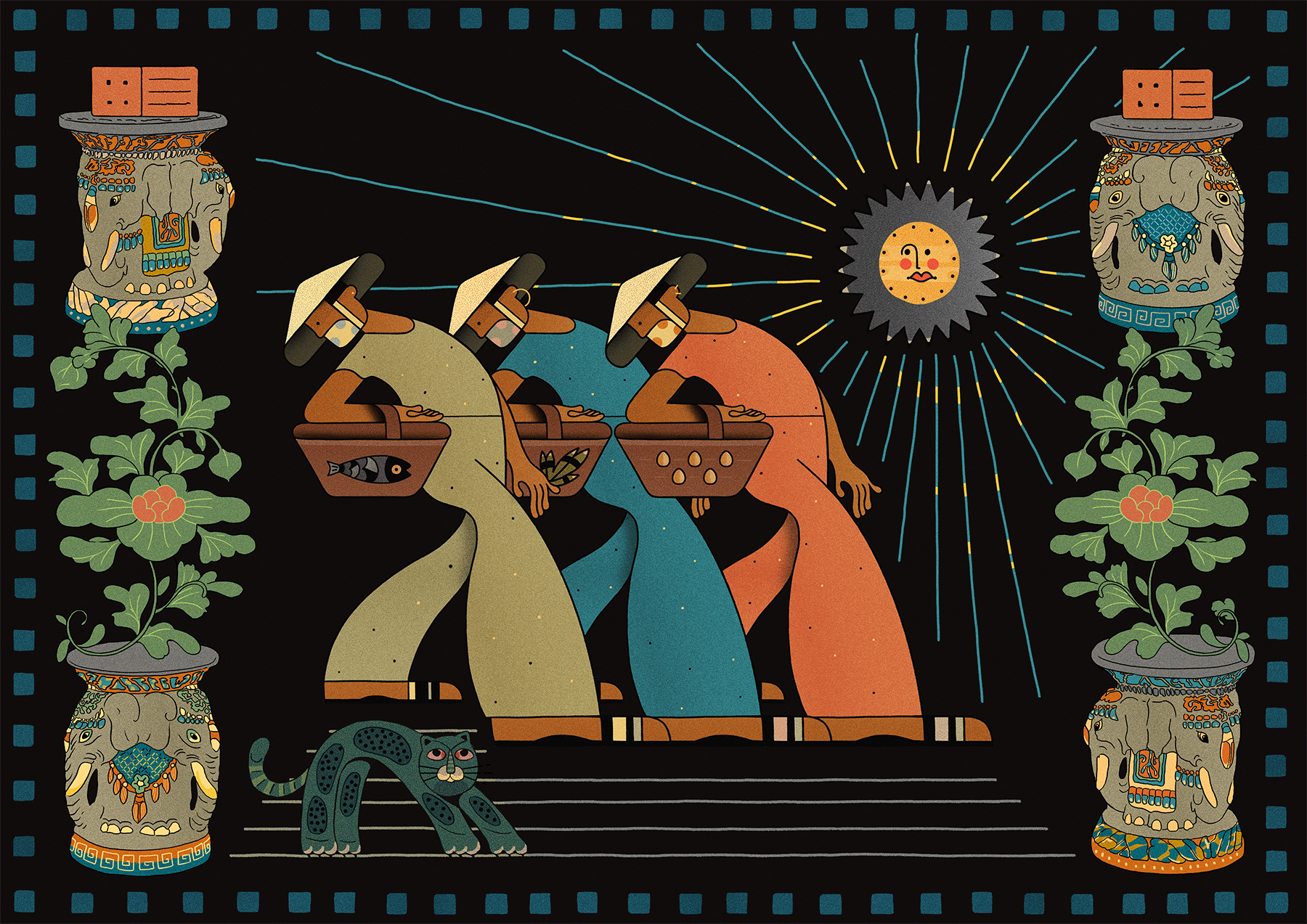
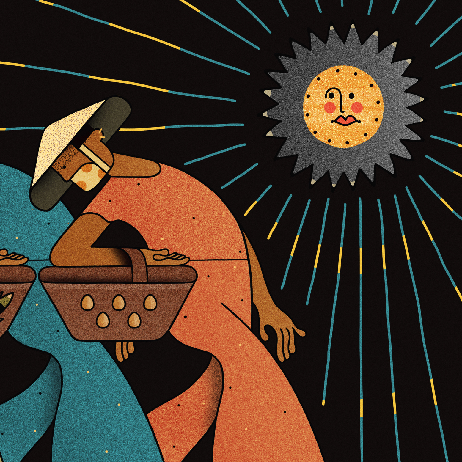
Ba Bà
Have you ever walked through a narrow alley in Vietnam, just as the city wakes up?
Where three women in patterned áo bà ba pass by — baskets full of fish, herbs, and quiet strength.
You don’t need to speak the language to feel the rhythm. Some stories are carried in footsteps.
Where three women in patterned áo bà ba pass by — baskets full of fish, herbs, and quiet strength.
You don’t need to speak the language to feel the rhythm. Some stories are carried in footsteps.
Medium: Pen and ink, Photoshop
Personal work
Year: 2023
Personal work
Year: 2023


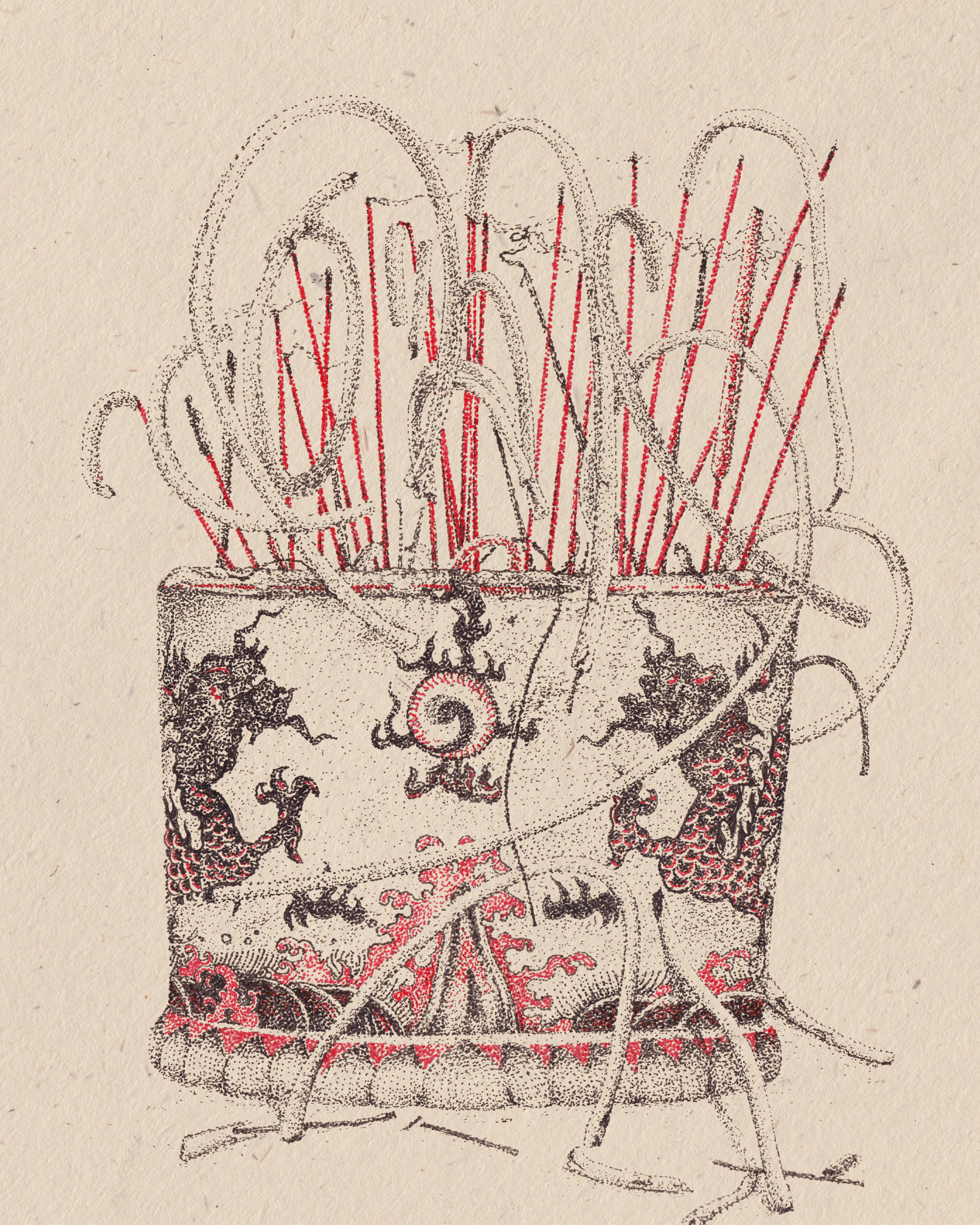
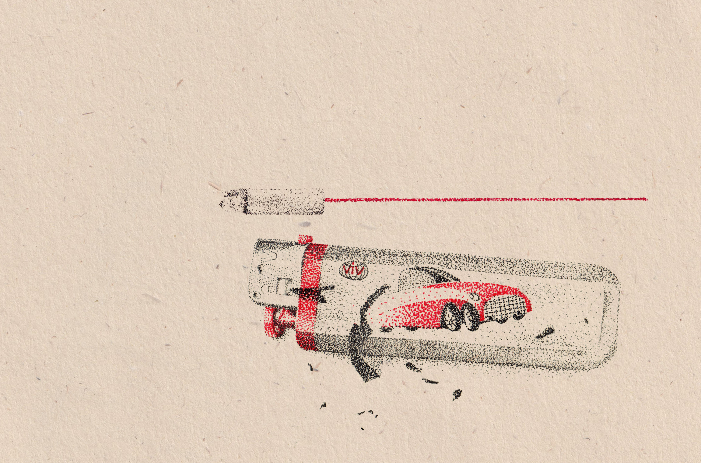
A Thousand Dots of Saigon
One day during a conversation, my creative director Kumkum Fernando said to me:
“Why don’t you start capturing things you see on the streets, the little details you notice, and turn them into your own archive?”
So I did.
I started collecting moments. A pack of incense with its colorful label. An old magazine I found at a scrap shop. A La Hán fish once popular to keep at home. A pair of plastic slippers. Things that feel ordinary now but carry so much of where I grew up. I snapped photos, kept notes, and turned them into illustrations using pen and dots in two colors: black and red. The same technique I used in Saigon2000.

Red feels vibrant, but also like a warning.
Black feels grounded, quiet.
Together they mirror how I see this city — alive, changing, and sometimes fading.


We first called this project “Found in Saigon”, but over time, it felt more like a collection of traces. A thousand tiny dots, holding on to what might be forgotten.
So I renamed it: A Thousand Dots of Saigon.
So I renamed it: A Thousand Dots of Saigon.
