

Crafting the Localverse: Pepsi Meal Cans
(English version below) Một năm trước, tụi mình ở Ki Saigon bắt tay vào làm dự án Pepsi Meal, mang theo một ấp ủ nhỏ. Một trong những nguyện vọng khi đó là làm sao tôn vinh được các món ăn địa phương khắp Việt Nam lên bao bì lon. Để chiếc lon ấy ít nhiều được đồng hành cùng bạn bè, gia đình trong những khoảnh khắc ăn uống, như một người bạn quen thuộc ở quầy nước giải khát, hay nép mình trong cửa tủ tạp hoá gần nhà.
Giai đoạn chập chững triển khai có lẽ là lúc khó nhất với bao thắc mắc lởn vởn trong đầu: “Liệu hình ảnh thể hiện ra có chạm đúng cảm nhận của người xem không? Món này thường ăn kèm với gì? Cái tô, cái chén đựng món này có gì đặc biệt?”. Thế là xách xe đi ăn, vừa no cái bụng mà hình dung cũng rõ ràng hơn ít nhiều.
Không nhớ rõ cụ thể là khi nào, có lần sếp hỏi mình như một lời gợi ý: “Ê quê của mày ở đâu Đức? Huế! Huế mày thường thích ăn gì? Bún bò? Vậy hãy vẽ thử một tô bún bò mà mày cảm giác được về nơi ấy xem.” Đó chính là điểm khởi đầu cho suốt hành trình khởi tạo nên những thiết kế sau này.
Làm dự án cực không? Cực, mà cũng thấy thích. Vì thích nên tìm cách để hông thấy cực. Tình cảm dành cho công việc có lẽ lớn lên từ những đêm muộn hay những buổi sáng sớm anh em sếp lính gặp nhau. Nhớ nhất kỷ niệm lâu lâu, gặp nhau ở quán, sếp vừa nhấp ngụm bia, tay vừa gõ cọc cọc ý tưởng trên laptop rồi tự nhiên cười sảng khoái. Tụi mình làm việc cật lực không hẳn vì áp lực deadline, mà chắc vì tình yêu, tự bản thân thấy cần cố gắng vì sự tin tưởng và kiên nhẫn mà đội ngũ Pepsi Việt Nam, khu vực và toàn cầu đã giao phó. Mỗi anh em trong team chỉ biết ráng làm tốt nhất phần việc nhỏ của mình, để dự án được thành hình trọn vẹn nhất có thể, và ở lại thật lâu với mọi người.
A year ago, we at Ki Saigon started the Pepsi Meal project with a simple dream. We really wanted to find a way to honor local dishes from all over Vietnam on the cans. We hoped that can would be like a familiar friend during meals with family and friends, or just sitting quietly on a shelf in a small neighborhood grocery store.
The early days were probably the hardest, with so many questions in our heads: "Will people really feel it when they see this? What is usually served with this dish? Is there anything special about the bowl or the plate?" So we just hopped on our bikes and went out to eat. Our bellies were full, and the ideas started to get a bit clearer.
I don’t remember exactly when it was, but my boss once asked me: "Hey Duc, where is your hometown? Hue! What do you usually like to eat there? Bun Bo? Then try drawing a bowl of Bun Bo that feels like home to you." That was the starting point for everything we designed later on.
Was it hard? Yes, it was. But we loved it. And because we loved it, we found ways to make it feel less like a struggle. Our love for the work grew through the late nights and early mornings we spent together. I remember times at a local spot, my boss would take a sip of beer while typing away on his laptop and then suddenly just laugh out loud. We didn’t work that hard just because of deadlines. We did it because of love, and because we wanted to honor the trust and patience that the Pepsi teams gave us. Each of us just tried to do our small part as best as we could, so the project could come to life and stay with everyone for a long time.
Peace love and gratude 🇻🇳✨🔥
Related Article: Salary. (Sổ Lương)


Main credits
Client: PepsiCo Vietnam
Agency: Ki Saigon
Strategic Planning: Indraneel Guha
Associate Creative Director: Chung Hoang
Visual Identity, Art Direction & Illustration: Luongdoo
Account Team: Thuy Ho, Quang Anh, Uyen Trinh
Social Team: Oanh Truong, Num
Media Team: Pepsi Vietnam, Ben Huynh, Thuy Trang, Nhat Hoang (Publicis)
Special thanks: We would like to express our deepest gratitude for the incredible support and trust from Ms. Venus, Ms. Chi Truong (PepsiCo Vietnam), chi An, chi Trinh, Ha, Trang and Bernard Cheng, Harjyot Singh Arora, along with the Pepsi Regional and Global teams.
Photography: Click On Team / Retouching: Thuat Vo

The Meeting In The Sky
Kite Illustrations
From fishing cats to rare birds, I illustrated 69 animal species — each one reimagined as a kite, designed to be seen from the sky. These formed the foundation of a visual system, which traditional Sri Lankan kite artisans then transformed into over 2,000 handcrafted kites.
Every form was designed with clarity and charm in mind. Sometimes, all it took was a single dot to bring a creature to life. Each kite was carefully colored to remain legible in flight, visible through translucent paper and sunlight.
I worked closely with my creative director, Kumkum Fernando, to develop the full illustration system for this project.
Project by Ki Saigon for Cinnamon Life.
I worked closely with my creative director, Kumkum Fernando, to develop the full illustration system for this project.
Project by Ki Saigon for Cinnamon Life.


Credits
Creative Agency: Ki Saigon
Creative Director/Designer: Kumkum Fernando
Head of Planning: Indraneel Guha
Illustrator: Luongdoo
3D Designer: Tue Nguyen
Consultant: Roshan Rajapaksha
Production Coordinator/Photographer: Nuwan Attanayake
Structural Engineers: Arzath Sajeer, Lahiru Galatharaarachchi
Artisan: Kavishka Gayashntha, Chaminda Perera, Chandra Kanthi, Gayani Madushanika, Sumith Kumara, Waruni Hansamali, Chanuka Hasindu, Damith Chalana
Installation Art Handlers: Madhuranga Roshan, Meril Munasinghe, Samantha Kaluarachchi, Prasath Dammika, Idusara Nimnath, Chaminda Gayan, Malith Lahiru, Thmidu Suranjith, Isuru Nissanka, Ishan Sewwandi Sampath, Dinesh Sampath, K. Samantha,Suranga Ranaweera, Damith Wijebandara, Thusitha Aththanayaka, Lalith Sanjeewa, Asri Udakara, Damith Wije Bandara
Music: Numa Gama
Research assistant: Ranni Tran
Read more from this journey:
🔗 Thích Thú Sri Lanka
🔗 When Lines Found Life: Crafting Animal Personalities
🔗 Meeting In The Sky: A Vibrant Blend of Nature and Arts

Pray with Pepsi
The Golden Can That Conquered the Tet Altar
The Scenario
One of the most significant rituals of Tet (Lunar New Year) is ancestor worship. Every home in Vietnam meticulously decorates its altar with offerings, including beverages, to show respect to elders. While Tet accounts for 60% of annual cola sales, Pepsi historically had no place on the altar. The space was dominated by Coke, as traditional belief dictates that "Red" is the ultimate lucky color for the new year. Pepsi, with its iconic blue packaging, simply didn't make the cut for this sacred space.
The core vision for this project was clear but highly ambitious: we needed to re-invent the Pepsi can to make it truly worthy of the Vietnamese ancestral altar during Tet. As a designer, I saw this as a profound cultural and visual challenge.
The Design Narrative
Based on the strategic brief, we completely redesigned the can to address two key insights. Firstly, GOLD beats RED for Tet. Gold is seen as more premium, prosperous, and worthy to present to the elders. But we also had to fix another problem: the size. Knowing that people usually prefer smaller cans that can easily fit and be stacked within limited altar spaces, the solution was the Pepsi Mini Gold Can.
With the form and color established, my focus shifted to the packaging artwork. The details needed to resonate deeply with local traditions. At the center is the Pepsi mark, acting almost like a pulse, with energy spreading outward through firework-inspired patterns. On both sides, “Tài” and “Lộc” are placed directly on the body. In Vietnam, these words are often used at the start of the year, as a wish for wealth and good fortune.
When it came to bringing this aesthetic to life in our campaign visuals, keeping things close to real life in Vietnam was important. The visuals were developed together with a young photographer, Thuat Vo, grounding the art direction in the familiar, authentic scenes we see in everyday homes and streets.
Results & Recognition
+11%
in total Pepsi sales volume
X2 TIMES
volume sales specifically for the small golden can
TOP 1
social Buzz in the Beverages category during the Tet holiday.
40,000+
young people engaged through organic participation, driven by user-generated content and the hunt for golden cans.
+11%
in total Pepsi sales volumeX2 TIMES
volume sales specifically for the small golden canTOP 1
social Buzz in the Beverages category during the Tet holiday.40,000+
young people engaged through organic participation, driven by user-generated content and the hunt for golden cans.


Credits
Agency: Ki Saigon
Client: Pepsi Vietnam
Strategic Planner: Indraneel
Associate Creative Director: Chung Hoang
Account Team: Thuy Ho, Uyen Trinh
Art Director & Illustrator: Luongdoo
Media Team: Pepsi Vietnam, Ben Huynh, Thuy Trang (Publicis)
Social Team: Oanh Truong, Minh Quan, Hong Linh
Photography: Thuat Vo
Year: 2026

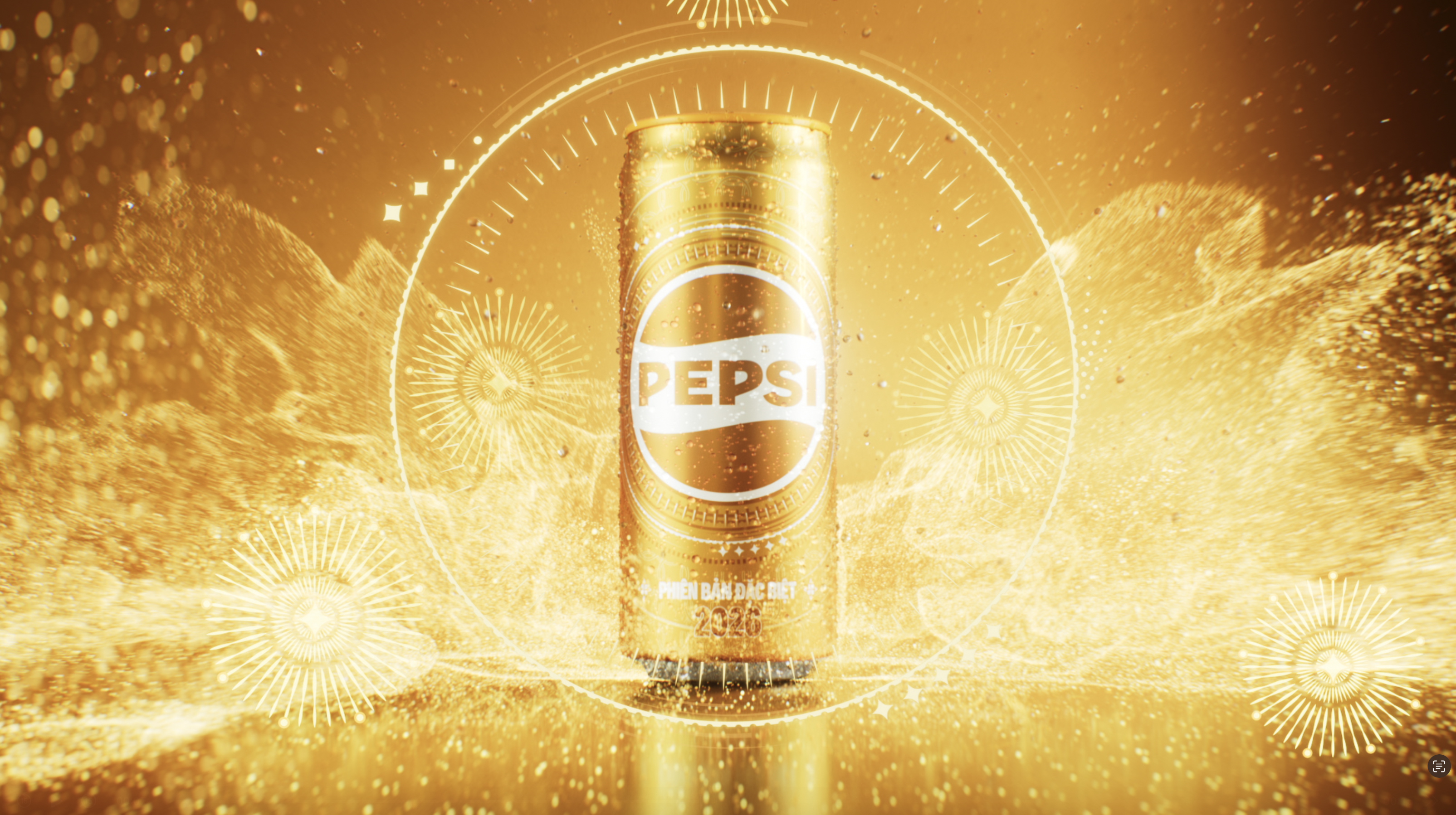
Pepsi Gold Can 2026
Part of the Pepsi Golden Tết 2026 campaign, the Gold Can sits at the center of the idea, alongside the TVC and larger activations.
It shows up in a quieter way. Not something you go out to buy, but something you might come across in the middle of preparing for Tết.
The speedometer is a very familiar image in Vietnam, something people see almost every day without really thinking about it. It carries a natural sense of rhythm and movement, which felt closely connected to the idea of Pepsi’s pulse, so it became the starting point for the design. I wanted the visual to come from something real and close to how people actually live, not an abstract reference, but a shared everyday detail.
For me, it’s meaningful that this can is built from that kind of observation, and in a way, represents something made for Vietnamese people from within their own daily experience.
For me, it’s meaningful that this can is built from that kind of observation, and in a way, represents something made for Vietnamese people from within their own daily experience.

The gold finish connects to the visual culture of Tet in Vietnam, where gold often represents prosperity and celebration.


Main Credits
Agency: Ki Saigon
Client: Pepsi Vietnam
Strategy Planner (Campaign): Indraneel Guha
Associate Creative Director (Campaign): Chung Hoang
Account Team: Thuy Ho, Uyen Trinh
Art Director & Illustrator: Luongdoo
Media Team: Pepsi Vietnam, Ben Huynh, Thuy Trang (Publicis)
Social Team: Oanh, Minh Quan, Hong Linh
Photography: Thuat Vo
Year: 2026

A gold can you can’t buy
To celebrate Tết 2026, Pepsi Vietnam released the Pepsi Gold Can, a special edition that wasn’t for sale and only available as a gift.
Designed to feel rare by design, the Pepsi Gold Can could only be received by purchasing two cases from the Pepsi, 7UP, or Mirinda range.
The idea turned a familiar New Year promotion into a moment of discovery. Not something you picked up, but something you had to find before it disappeared.
This 15-second film brings that idea to life, with the Gold Can at the center of the story.
A seasonal reward, created to be found at the right moment.
Credits
Agency: Ki Saigon
Client: Pepsi Vietnam
Production House: May Production
CGI & Animation Studio: Juice
Lead Designer & Can Illustration: Luongdoo
Designers: Huynh, Van
Copywriter: Nhi
Account Team: Thuy Ho, Uyen Trinh
Social Team: Oanh, Minh Quan, Hong Linh
Media Team: Pepsi Vietnam, Ben Huynh, Thuy Trang (Publicis)