

Behind the Colors of Peace
Digital illustration for Pizzas For Peace
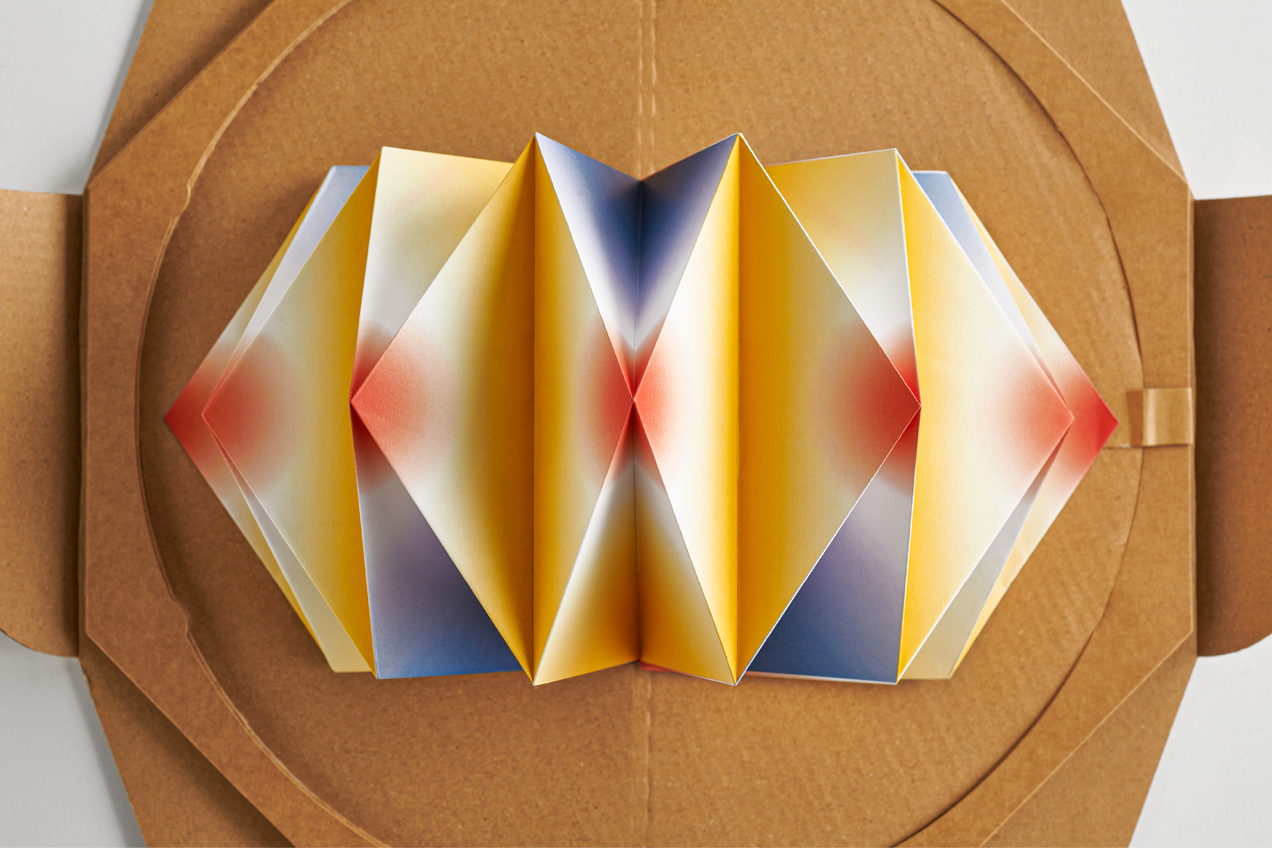
On World Peace Day, Pizza 4P’s and Ki Saigon launched Pizzas For Peace, a campaign that turned symbols of conflict into handmade pop-up flowers. Each pizza box unfolded into a blooming 3D form, with colors blending two national flags. My role was to create the flower templates — the digital color maps for something that would eventually be folded by hand.
Recognized by D&AD 2021, Pizzas For Peace, Packaging Design/Shortlist
-
See the full project at: LINK
-
See the full project at: LINK
At first, I thought I could just start coloring. I opened Illustrator, picked some tones, and began filling shapes.
That’s when Kumkum, our creative director, walked past my screen and said,
“Wait. What are you doing?”
“Don’t just color random or freestyle. You need to look at how the actual paper folds — what parts show, what parts get hidden. And make sure the color proportions are right, so people can recognize both countries.”
“Wait. What are you doing?”
“Don’t just color random or freestyle. You need to look at how the actual paper folds — what parts show, what parts get hidden. And make sure the color proportions are right, so people can recognize both countries.”


He was right. I hadn’t yet understood how the paper would behave in real space. What seemed balanced on screen could vanish, clash, or say nothing at all.
Zac Buehner, the folding artist, had already created a mock-up of the flower. He gave me one early on. I unfolded it carefully, laid it flat, and traced the fold lines into vectors. Even flattened, the creases were still visible. They quietly revealed which parts would be tucked away, and which parts would bloom into view. That became my guide. From there, I started planning how the colors should flow, where to hold back, and how to balance the percentage between each flag.


It was the first time I realized that even something as “digital” as color had to respond to gravity, folds, and real-world mechanics.
Kumkum had another line that stayed with me:
“It’s not about making it pretty. Make it precise. People need to feel the flags — not just see the petals.”


Later, during print checks, I visited the workshop with another teammate. The final flowers were folded there by friends and family of a local household who had worked with paper for years. It wasn’t a production line. Just a few tables, quiet conversations, and steady hands turning flat prints into something with weight and meaning.
This project came together because each person brought their care, whether through folding, directing, testing, or coloring. I’m proud of the part I played, but even more thankful for the craft and collaboration that held it all together.


Credits
Project: Pizzas For Peace
Creative Agency: Ki Saigon
Client: Pizza 4P’s Corporation
Creative Director: Kumkum Fernando
Kumkum Fernando
Illustrator: Duc Luong (Luongdoo)
Artist: Zac Buehner
Copywriter: Indraneel Guha
Planning Director: Indraneel Guha
Account Assistant: Huy Tran
Producer: Tue Nguyen
Producer Assistant: Tran Khanh
Production Assistant: Hoang Nguyen, Quan Nguyen, Dinh Minh
Production Company: VAIB Production
Photographer: Wing Chan
Photographer’s Assistant: Ai Ha
Videographer: Justin Ngiam